Urban Geometry. © Copyright 2019 G Dan Mitchell – all rights reserved.
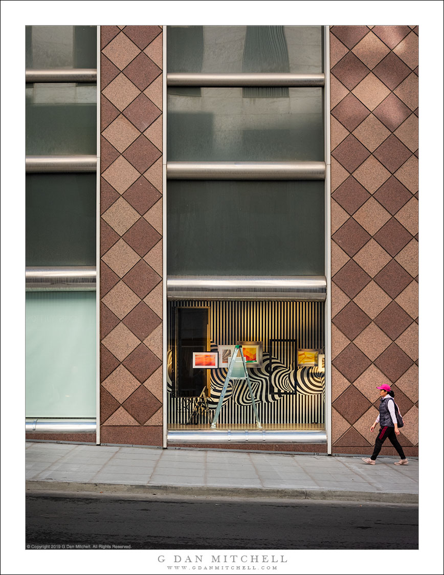
A woman walks past a building with a display under construction.
One element of the urban/street world that fascinates me is the juxtaposition of “perfect” structures — geometric patterns, shiny metal, highly designed forms — with the imperfect and always-deteriorating nature of this world — peeling paint, dirty sidewalks, constant construction and reconstruction, accumulated dirt, and so forth. Long ago the fact that urban structures fell short of the theoretical perfection offered in architectural drawings bothered me, but now I find it fascinating.
This is an example of one of those little scenes that always seem to catch my eye. The facade fo this building is, from one perspective, quite boring, even though its patterned wall and metal lights depart from typical (and often rather plain) urban surfaces. But notice some interesting things about it. For example, because the sidewalk and street are inclined, the designer was faced with a question: align the metal form beneath the windows with the sidewalk or align them with one another? And if you align with the sidewalk — as is done here — what do you do about the size of the windows and about their alignment? (The sizes were kept the same, leaving the lower bank out of alignment… but they are “corrected” in the second level!) Beyond that, the contrast with the op-art nature of the under-construction window dressing is fascinating. I waited for a passer-by to enter the scene before making the exposure.
G Dan Mitchell is a California photographer and visual opportunist. His book, “California’s Fall Color: A Photographer’s Guide to Autumn in the Sierra” is available from Heyday Books and Amazon.
Blog | About | Flickr | Facebook | Email
Links to Articles, Sales and Licensing, my Sierra Nevada Fall Color book, Contact Information.
All media © Copyright G Dan Mitchell and others as indicated. Any use requires advance permission from G Dan Mitchell.
Discover more from G Dan Mitchell Photography
Subscribe to get the latest posts sent to your email.
