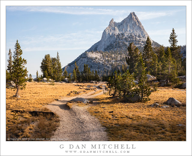
From time to time people ask about the border around my photographs and the inclusion of various text elements within them. Since the question came up again recently I thought I’d explain.

First, borders and watermarks and all the rest are an intrusion in an image, and we would all prefer to see photographs without those elements – preferably in the form of beautiful prints. Prints are the target output for my photography, and online versions are merely stand-ins for the prints. In an ideal world, it would be lovely to be able to share photographs online in an equivalent form.
However, I have to balance my desire to share with the realization that being overly innocent about these things is unwise.Opinions about this vary widely — ranging from those who feel fine about putting full size photographs out there “as is” to those who won’t share anything online at all. My position lies between those extremes. I think that it is possible to enjoy my photographs as they are presented on the web — at least that’s what people tell me! I also understand that no technique can completely thwart the bad guys. So I have arrived at a balance that works for me.
I do several things with photographs that I release “into the wild” in electronic form:
- I limit the size to approximately 600 pixels in the longest dimension. This seems like a decent compromise between showing some detail, being reasonably visible as a screen image, and not providing more image detail than necessary. (This size also displays well on a wider range of viewing systems, from smartphones to tables and computers.)
-
I include EXIF data in the files so that those who want or need more information about the image source and characteristics may find it. This includes exposure data, keywords, location information, date of exposure, copyright, and contact information. (Some files produced by merging multiple images may not include all data types.)
-
I place a small copyright notice within the border of the image, typically near the lower edge though it may be in other positions if I think that will be better for a given photo.
-
Some watermark text is usually included somewhere within the image as well. I try to strike a balance between visibility and avoiding too much interference with the image itself.
-
I place a border around the photograph and include identifying information within the border. One reason that I do this is that I have little control over the presentation of my photographs in places such as search results. Since the border is part of the image, my identifying information appears even in pages of image search results. In addition, the border lets me separate the photograph from surrounding “stuff” on the page, much as the mat and frame do when I hang a print.
To counteract the negatives that some associate with the addition of borders and watermarks, I should note some positives, too. When a watermarked/branded photograph shows up in search engine results, the identity of the photographer is immediately apparent—and folks who are legitimately interested in the image and the photographers can more easily find both. The border itself helps separate the photograph from the surrounding visual clutter of web pages. And it can discourage — though not completely stop — folks who might want to snag an image off the web that they should license or purchase.
There is no perfect way to handle this issue, and there certainly is no universal agreement about one “right” way to do things. This is my personal accommodation, and I hope my reasons make some sense.
(If you are interested in how I create my borders/watermarks, I have posted some information here at the blog – try starting here.)
 G Dan Mitchell is a California photographer and visual opportunist. His book, “California’s Fall Color: A Photographer’s Guide to Autumn in the Sierra” is available from Heyday Books and Amazon.
Blog | About | Flickr | Twitter | Facebook | Google+ | 500px.com | LinkedIn | Email
All media © Copyright G Dan Mitchell and others as indicated. Any use requires advance permission from G Dan Mitchell.
Discover more from G Dan Mitchell Photography
Subscribe to get the latest posts sent to your email.

Good question. I used to make borders black since doing so does make the image look brighter by comparison. However, I would almost never mat a photograph in black, and when I’m thinking about steering the photograph in the direction of a print (which, to me, is usually more central than screen display) I find that the dark border pushes me in the direction of a print that will be too dark.
Sherwood, you really need to see some of my prints sometime. :-) I’m about to hang a really big one in my office, and I’ll let you know when it is up.
Dan
Cogent, as usual. I have a question about the borders you use, though: why white? I like to view images on black, but a white border defeats the pleasing effect of seeing them that way.