(Update July 30, 2011: Since the original test was published quite a while ago, I have added this link to the outcome of this test. Of course, if you want to give the test a try yourself, you should read the whole article, try answering the questions, and only after that come back here to follow the link to find out how your response compares.)
Yesterday I posted a series of three images in a couple forums I frequent along with a request that a few people try a little experiment with them. Here it is for anyone else who would like to participate.
Below on this page are three images presented at a typical web viewing size. The question has to do with what you see when you look at them in your browser. (Please read some additional material further down that explains why you must only look at the photos in your browser for the purposes of this exercise.) Considering all aspects of the presentation of the images, in the end there are three possibilities:
- all three images seem identical – e.g. there are no perceptible differences among them.
- all three images seem different from one another – e.g. each is visibly unique.
- two images seem identical but one seems unique – e.g. one is visibly different from the other two, and those two seem visibly identical
Before you give it a try, there are a few “conditions and warnings.”
- You could easily cheat by opening the files and looking at EXIF or other data. But don’t. Or if you cannot resist, please keep your observations to yourself. I’ll stipulate that you could find differences in file parameters by looking there – but that isn’t the point in this case.
- You should not assume that I am incapable of modifying EXIF and file size and so forth in ways designed to trick those who “cheat” and inspect the files directly. Nor should you assume that I have. Or that I have not. Or whatever… :-)
- The question is not “are they three separate exposures or one exposure,” so if, for example, you think that the water looks exactly the same in all three images that, in and of itself, isn’t relevant to the question – and your assumptions may or may not necessarily be correct.
- The question is not whether this is a good, bad, or indifferent photograph – I make no claims beyond the fact that it is used here as a test image.
- The question is not “what would they look like at 100% magnification?” Interesting question, but here the question is just about what you see in the images as presented.
- If you think that you see differences among them, the followup question concerns the nature of the visible differences. Note that the follow-up question is not “how might the differences have been produced?” Just describe what you think you see.
- There is no “point” inherent in the exercise, though when I explain more after getting some responses you might or might not draw some of your own conclusions. For now, just compare what you see.
(Follow-up observation. Having access to server logs, it is interesting for me to note the percentage of people who share a response versus the number of page views… ;-)
(Note on 9/10/11: Especially on flat-panel monitors, the position of the image on the screen may create visible differences that are not in the source images. Try to view the samples in the same location on your screen to avoid being misled by this. Once you make your observations and read comments here and in the follow-up post, you may see that others noticed and commented on this.)
I have set this up so that clicking on each image will open it in a new window or tab – though it is a bit awkward in that you’ll need to manually return to this window after doing so. Once they are open in three tabs (best) or windows you can click between them to compare more carefully if you wish – but do stick to viewing them in your web browser since that is part of “the question.”
After viewing, leave a comment stating which option (1, 2, or 3) best describes what you see. In addition, if you select option 2 you might offer a brief explanation of differences you see. (Again, not analysis of downloaded files please! That isn’t the question and it spoils the “game” for other participants. ) If you select option 3 tell us which one is different from the other two and perhaps what you observe about the visual difference.
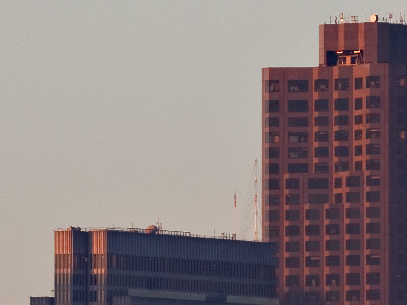
Here are the images (Click to open each in new windows if you would like – you’ll have to manually return to this window each time – or feel free to view them here “in line.”):
A. 
B. 
C. 
Thanks for participating!
Dan

