(“A Photograph Exposed” is a series exploring some of my photographs in greater detail.)

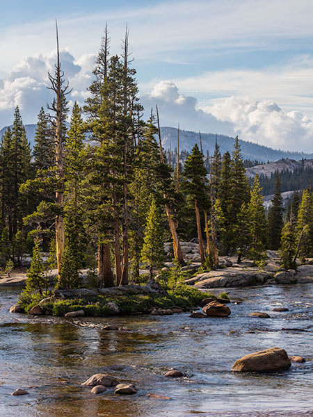
If you follow this website you may have seen this photograph before — it is one of two that were the subjects of an earlier article (“A Photograph Exposed: One Subject, Two Compositions“) focusing on compositional decisions I made when I photographed this Sierra Nevada subject. In this companion article I want to look at the next step — going from that original exposure to the final (at least for now!) interpretation of the subject that you see above, and the how and why of post-processing the image.
For me, post-processing is as much a part of the creative process of photography as is composing and making the exposure. In fact, many of the decisions that I make at the time of exposure anticipate what I may do during the post-processing stage. These decisions recognize that the camera does not “see” the same way that we do, and that simply trying to produce an exposure that looks the exactly like the actual scene is often both hopeless and counterproductive.
Seeing Versus Photographing
On the scene, our vision is extraordinarily selective. As our gaze shifts within the scene, our eyes instantly refocus and readjust to the extreme local light levels in shaded and highlighted areas, we pay the most attention to what we regard as most important and we diminish or ignore distractions, we respond to non-visual cues of temperature and sound and fragrance, we watch the light change, we see the effect of blowing wind on trees and clouds, and our state of mind affects all of this. The camera is objectively incapable of “capturing” these things in an analogous way, yet somehow we do want to create photographs that evoke or suggest these things, and which do not limit themselves to embodying only that which can be literally “captured” by the camera.
What follows is partly technical — focusing on some basic techniques that I might apply in the post-processing phase. But it is also about how those techniques may be applied for expressive and subjective reasons.
Making the Photograph
To begin, what did I see in this scene? (You may want to follow the earlier link to the previous article about the composition, in which I describe some of these factors in more detail.) The central island with the tall trees, standing forward from the background river bank and surrounded by flowing water was the central component of the scene for me. While it was central, it was also embedded in the larger context of a scene that extended from the close water through the background forest, on to the more distant ridges, and then culminated in the clouds and sky.
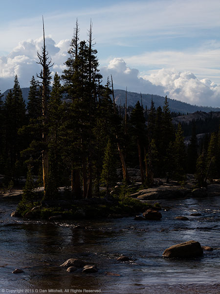
The light, as always, was a primary interest. My focus was the beautiful light on what I’ll call the “tree island,” the central island in the river with the tall trees. The light was variable. There were clouds above and to my left that intermittently blocked the sun and then cleared to let its full light shine on the scene. I timed the photograph for an intermediate moment when the light was partially softened by clouds but clear enough to have a directional quality. This created two “problems” to deal with. First, while the light on the trees “glowed” nicely it was still somewhat reduced in intensity. Second, the ideal exposure for the foreground trees was quite different from an ideal exposure for the very bright sunlit clouds visible in the distance. With that in mind, I did not expose for an ideal “straight out of camera” quality on the tree island, but I instead “under exposed” (though here I’d prefer to say “selectively exposed!”) in order to avoid losing details in the brightest parts of the clouds. Here is what “the camera saw” as a result.
I can hear you exclaim, “Yuck!” And I don’t blame you. As a finished photograph, not only would this look quite awful, but it also doesn’t remotely suggest the scene that I saw with my own eyes. The only element that is “exposed correctly” — in the sense that it looks “right” straight out of the camera — would be the bright fluffy clouds above the mountains. Everything else looks way too dark, to the point that virtually none of the interesting detail in the scene is visible at all, especially on the tree island that is my main interest. Some important areas are essentially black, and all of the beautiful detail and lovely light has gone missing!
Pretty Image or Best Scene Data?
But, here is the key fact. My goal was not to see a nice photograph on the rear display of my camera. My goal was to capture the best possible scene data so that I could work with it to create the best possible photograph in post and then the best possible print — one that would look like what I remember of the scene and even express some of what I felt about it, especially about that beautiful light. Technically, I knew that if I went with a nice average exposure (what the camera’s metering system would have selected) the bright areas would be blown out, losing all detail and becoming pure white, with almost no hope of recovery. In addition, I knew that if I exposed to protect those highlights, my camera would still record plenty of detail in the dark areas (as “seen by the camera”) and that I could reclaim that detail by making adjustments during the post processing phase.
RAW Conversion Adjustments
Let’s take a look at the adjustments I made in my raw conversion software. Since I prefer to work in Photoshop, I use the Adobe Camera Raw (ACR) conversion software and then open the converted file in Photoshop as a a “smart object.” Smart objects can be edited non-destructively — meaning that I can return to the raw conversion at any time to make further adjustments and refinements. I prefer to make as many general changes to the file in ACR as possible, partly because they are all non-destructive and partly because I prefer to start out with the best possible initial image in Photoshop.
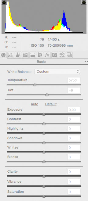
To begin, here is the basic settings panel for the raw file in ACR.
The temperature and tint settings are defaults for the converted file. I have zeroed out all of the other adjustments here. (In the real world I use some default non-zero starting settings for certain values.) Looking at the graphic histogram display at the top of the panel is instructive. Clearly a lot of image data is near the left, or dark, end of the spectrum. Yet, very little is so black as to jam the curve up against the left edge, making shadow recovery very challenging in some cases. Conversely, the curve does not go all the way to the right, or bright, end of the spectrum. This suggests that, as I planned, I have plenty of headroom to make adjustments to lighten things. In addition, the bulk of the image data is spread across a wide range. Ideally, a curve slightly closer to the right might have been even better, but this one isn’t bad at all, and the file has great potential.
Keeping in mind that my main goal is to bring the light back into this image, let me start introducing some changes. I’ll simply name them below, so refer to the screenshot above if you want to know where and what they are. I’ll include another screenshot below that includes all of the changes on this panel.
- A first step is to protect the sky as I make other changes to the image — as I brighten everything else I need to avoid letting that work unnecessarily brighten the clouds and destroy their detail. I do this using a filter with a gradient mask in ACR. This lets me define a gradient that separates the sky from the lower portion of the scene and then apply settings to just the sky. One challenge is adjusting the sky while minimizing unwanted effects on the upper portion of the mountains and especially the tops of the trees. I’ll simply list the settings here with brief explanations:
- Exposure: -0.30 — pre-compensates for expected adjustment to the whole image
- Contrast: +70 — maintains and increases contrast in the clouds and sky to maintain detail
- Highlights: -19 — avoids blowing out the brightest portions of the sky
- Shadows: +40 — minimizes darkening effect on upper portion of the mountains and trees, part of which are included in the gradient area
- Whites: -10 — also helps avoid blowing out the brightest portion of the clouds
- Blacks: +39 — also minimizes/controls the darkening effect on the upper trees which are included in the gradient area.
- I raise the Temperature setting slightly from 5750 to 6000 in order to slightly warm the color.
- As a first step to lightening the image I raise Exposure to +0.90, a fairly significant increase. This moves the central portion of the histogram curve towards the right, mostly brightening mid tones.
This is a bit lighter but the effect is not at all extreme — in fact, it is not yet nearly enough. On the plus side, we start to see a bit more detail in the darker parts of the scene, and the sky and clouds still seem to be in pretty good shape. From this point, lets move on to some additional adjustments that will bring more light to the forest, trees, and the river surface.
First I’ll deal with the remaining very dark areas. I’ll make some fairly radical adjustments to two settings that primarily work on darker tones.
- Shadows: +85 — this tends to open up the shadows, and the darker tones that are not as dark as black become lighter.
- Blacks: +35 — This brightens the black and near black tones and can help unblock shadows.
Things are clearly getting quite a bit lighter now. In fact, we are approaching an overall brightness level that is probably reasonably close to that of the original scene itself, as I saw it when I was there. However, I still have some problems, in two broad categories. First, there are some issues that I still haven’t fixed — for example some of the darkest areas are still too dark. Second, all of these adjustments have introduced some new issues that I need to compensate for — notably the now-too-bright sky and an overall flat quality to the middle tones. So it is back to ACR to work on these issues.
- Highlights: -50 — this compensates for the unneeded lightening of the sky, mostly by reducing the brightness of tones that are a bit below pure white.
- Contrast: +30 — All of the control of highlights and lightening of shadows has had a secondary effect of compressing mid-tone contrast. Raising contrast here begins to compensate for that and return the mid-tone contrast to where I want it to be.
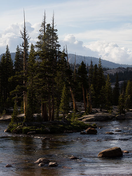
This compensates for the “dull” effect at the previous stage of editing. The image is looking generally pretty decent. At this point, aside from cloning out any dust spots or similar issues and making a few other minor adjustments, the work in ACR is pretty much complete. Here is the final version of the converted file that I’ll open in Photoshop as a “smart object” for additional editing.
I make a few final adjustments which are fairly typical starting points.
- Clarity: +12 — this increases the overall sense of contrast in the image just a bit. It generally amplifies (just a bit at this setting) the general contrast between adjacent light and dark areas.
- Vibrance: +12 — This affects color, and raising the value tends to intensify the less intense colors while not overdoing those that may already be saturated. The effect of this value is very subtle, and it isn’t unusual to raise it more than this minimal amount.
- Saturation: +12 — Saturation generally increases the overall intensity of colors. The effect is often best used sparingly because it affects all colors, including those that might already be intense enough, and since one of the most common cliches in photography is overdone saturation.
Next — and finally! — I click the “open object” button in ACR to open the file as a 16-bit ProPhotoRGB smart object in Photoshop. ProPhotoRGB is a wide gamut color space that arguably provides the best data to additionally edit the file, and opening as a smart object allows me to easily bring the file back into ACR for further editing should that be necessary.
(Note: ACR is a much more capable editor than many people realize, and the ability to edit non-destructively is not the only advantage. For example, where I created a gradient adjustment for the sky, I could have created additional gradient adjustment areas for other areas of the screen. I can paint in multiple adjustment brushes. I can make extensive general or targeted adjustments to just about anything: color, contrast, various brightness controls, sharpening, and more.)
Editing in Photoshop
While I generally do like to accomplish as much as I can in ACR, I virtually always do additional processing in Photoshop. Sometimes the Photoshop editing can be very involved, using many layers and masks. (Masks allow me to constrain layer adjustments to defined areas of an image.) However, in the case of this photograph the Photoshop adjustments turn out to be very basic — because most of the needed work was done in ACR. Let me summarize each of the general changes in the photograph and show an image of the effect at each stage. (I’ll leave out the sharpening step since that is difficult to see in these small jpg screen images.)
Curve Adjustment Layer
Curves are incredibly powerful tools in Photoshop, and they can be used to do a wide variety of things. While the most common use is to adjust the relationships between areas of different brightness levels — perhaps lightening mid-tone values without touching light or dark values or to increase apparent contrast for example, they can be used to make color adjustments and for all sort of other purposes. Some of us think that curves may well be the most useful and powerful post-processing tools.
One of the first things that I almost always do is apply a curve to the image, either in “normal” mode (which can cause some usually OK but not always pleasing color shifts) or “luminosity” mode (which avoids the color shifts). The simplest tasks for applying filters involves setting a black level (setting a floor for the darkest tones), a white level (the ceiling for the brightest tones), and adjusting the steepness of the curve in between to control (and often increase) contrast in middle tones. In this image the darkest and lightest tones are already close to where they should be after my work in ACR, but I apply a simple curve to mostly lighten the image a bit. (I won’t show the result separately, since the effect is very subtle.)
Shadows/Highlights Adjustment
(Note: The tool described here has been deprecated in current versions of Photoshop. I’m leaving the description below largely as it was in the original version of the article. Today I would more likely accomplish much of this using the exposure, highlights, shadows, blacks and similar faders… or by using masked curves in Photoshop.)
While adjusting the curve layer I notice that there are still very dark areas that have lost detail. This is a subtle thing, but it can make a significant difference when it comes to filling the image with light. The main issue is in the very darkest tones, such as those in the dark rocks along the waterline of the rock island. I lighten these areas a bit by selecting the background layer (my imported smart object) and adding a “Shadows/Highlights” layer — which also turns out to be nondestructive if you add it this way! I make some simple adjustments in the Shadows section.
- Amount: 5 — this slightly increases the brightness of the very darkest tones only.
- Tone: 25 — lowering to this setting from the default level of 50 causes the brightening effect to be applied only to the very darkest tones, leaving near-black tones mostly alone.
- Radius: 50 — this graduates the onset of the effect across a 50 pixel width.
Again, the effect is subtle, and it mainly operates on only the very darkest shadows. In any case, there is an example the incorporates the overall Curve layer and the Shadows/Highlights adjustment.
There is still a bit more to do. One way to help focus the viewers attention on the most important subject is to make use of adjustments to brightness. This can be done by darkening the surrounding areas (or vignetting) to make them seem less present, and/or by lightening the central area. In this scene I want the bright light on the tree island branches to have a bit more presence, so I create a curve layer and increase the brightness of the lighter tones and even the darker tones on the island just a bit. I set the mode to “hide all” (to initially hide the effect of the change) and then paint in white on the mask to reveal the effect in the areas I want to be lighter. The effect, again, is subtle unless you watch it happening on the screen.
Dodging and Burning
Finally I move to what may be the most subjective step of all, the use of the venerable techniques of dodging (selectively lightening an area) and burning (selectively darkening an area). There are many ways to do this. For example, it can be done very effectively using a curve layer or layers. In this case I simply made a new overlay layer with 50% gray fill, and then used the dodge and burn tools to dodge (mostly) and burn. The idea at this point is to add light to certain areas (notably the rocks on the bank beyond the island and in a few other areas on the island itself) and to possibly darken a few areas that might otherwise too strongly draw the viewer’s attention.
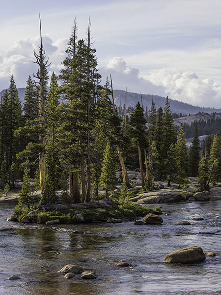
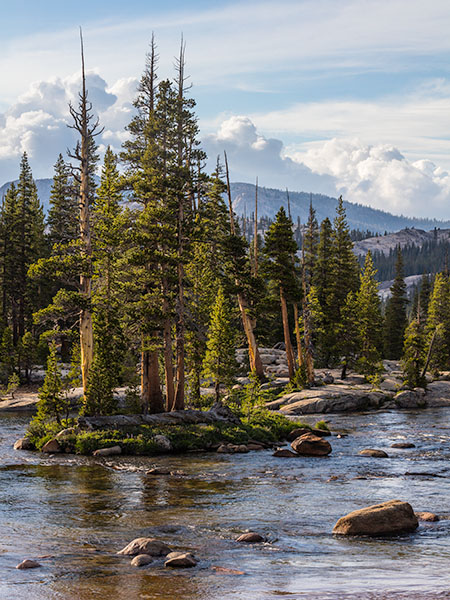
And with that step completed, we have the final (for now!) version of the photograph. (UPDATE: Since this article was originally shared, I have fine-tuned the photograph a bit. There is now a subtle vignette to draw attention toward the cent of the image, and I have made some minot adjustments to color balance and luminosity levels.)

There is nothing to say that what I have done here is “the right,” “the best,” or the only way to work with this photograph. In the end it is a complex synthesis of what was literally in the scene, my memory of what I saw while I was there, the things I want to emphasize and deemphasize, and decisions that may simply make the photograph more successful as a visual image. And, perhaps most importantly, the final photograph reflects this photographer’s way of seeing this and other subjects.
NOTES:
- July 2025: I recently returned to this article nearly a decade after I first shared it. The basics still hold up, though changes in current software mean that I might approach some things differently today. For example, we can do even more in Adobe Camera Raw (ACR) now than we could a decade ago —such as select the sky and the landscape separately and more.k
The Photograph Exposed series:
- A Photograph Exposed: “Submerged Boulders, Lake, and Cliffs” (2010)
- A Photograph Exposed: A Tale of Light (2011)
- A Photograph Exposed: Photography and Luck (2012)
- A Photograph Exposed: “San Francisco Skyline — Winter Fog and Haze” (2015)
- A Photograph Exposed: “Two Rocks, Morning, Racetrack Playa” (2015)
- A Photograph Exposed: “Two Islands, Fog” (2015)
- A Photograph Exposed: “Shoreline Reflections, Trees and Rocks” (2015)
- A Photograph Exposed: One Subject, Two Compositions (2015)
- A Photograph Exposed: Technique and Interpretation in Post (2015)
- A Photograph Exposed: Je Suis Bleu (2022)
G Dan Mitchell is a California photographer and visual opportunist. His book, “California’s Fall Color: A Photographer’s Guide to Autumn in the Sierra” (Heyday Books) is available directly from him.
G Dan Mitchell: Blog | Bluesky | Mastodon | Substack Notes | Flickr | Email
All media © Copyright G Dan Mitchell and others as indicated. Any use requires advance permission from G Dan Mitchell.
Discover more from G Dan Mitchell Photography
Subscribe to get the latest posts sent to your email.


Excellent and helpful post Dan!
thanks