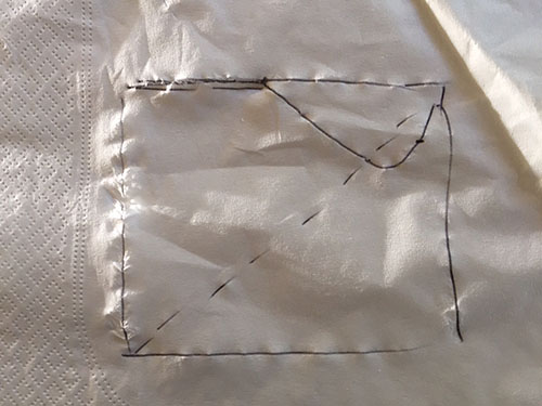
Earlier this month some friends and I got together in San Francisco, as we do every month, to share prints and talk photography. One friend shared prints of some beautiful night photographs he had made of a San Francisco subject. As we looked for little things that could make excellent prints even better we got to talking about highlights and how to control them. There are quite a few ways to do this, and I drew a little picture on a napkin to illustrate one technique I sometimes use to get a bit more detail out of areas that appear to be nearly pure white. The drawing looked a lot like the following.
It doesn’t look like much here, but trust me when I say that it made sense at the time. My friend picked up the napkin and took it with him as a reminder… and then a few days later contacted me to say he had lost the “napkin notes” from our conversation. He asked if I would mind describing the technique again. I said I’d do it — and three weeks later I finally got around to writing it up in this article!
Photographers using digital cameras have to watch out for over-exposing highlights. While we can recover a lot of detail from dark shadows, especially with current digital cameras, there is much less headroom at the bright end of the spectrum. When the exposure is too bright it is easy to end up with lost details in high luminosity areas. Go a little too far and you end up with that bane of digital photography, blown highlights, where the bright areas are simply pure white, leaving little or no hope of recovering the lost details.
Depending on the nature of the problem there are several ways to recover usable image data from over-exposed highlights. The highlights and white sliders in Adobe software can often help, for example. In some tough cases it is possible to clone in a bit of detail into areas that are completely white.
When I want to increase the visibility of nearly white details in small, very bright areas, and I don’t want to affect the whole image to do it, I sometimes use a masked curve adjustment layer in multiply mode — and that is what the little napkin drawing is about. The idea here is to keep the very brightest white tones white, but to slightly darker the tones that are just a bit less white in order to slightly increase the visibility of texture that was lost due to a bright exposure. You might find this useful with subjects like reflecting rock surfaces, very bright sidewalks, some small highlights from water, and many others. Let me use a photograph to demonstrate.
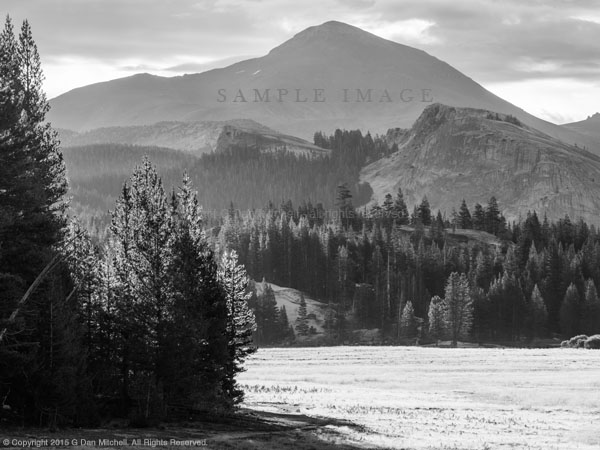
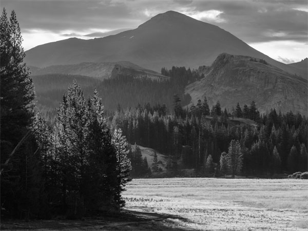
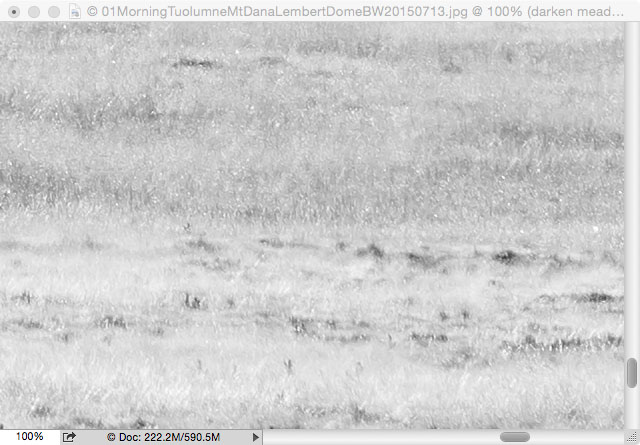
Although it is difficult to see in this small web image, the meadow at the lower right is very bright and a bit washed out. This area was in direct sun, its color was late-season brown/yellow, there was dew on the grass, and it was backlit! In addition to my general concern about some extremely bright sections that lose fine detail, the whole meadow seems so bright that it distracts attention from other elements of the scene. Here is an enlarged 100% crop of a section of the meadow grass.
The technique I use to compensate in this case involves applying a masked curve adjustment layer to the meadow, while leaving the rest of the photograph alone. I want to apply a curve that will mostly darken the tones that are just a bit less than pure white. My goal is to make those selected levels just a bit darker, thus making these bright textures a bit more visible. The example shown above is just about ideal for this technique since there is still plenty of almost white detail that is just a bit brighter than I would like.
I start by creating a curve layer in Photoshop. By default it is a normal mode curve, one of two types (along with luminosity mode curves) that we frequently use to adjust images in Photoshop. But I’m going to do some seemingly odd things to this curve. First, I choose multiply mode from the pop-up menu instead of the default normal — turning the whole image quite dark. Then I apply a very odd-shaped curve like the one shown below. To create this I select the “hand tool” right below the word “Preset:” and then click on a point just a ways down from the upper right end of the curve to “lock” this part of the curve in place. (This point is seen in the middle of the darker “peak” near the right side of the histogram. I may leave it on the diagonal line or I may move it lower a bit for a more striking change in near-white luminosities.) Next I click the existing adjustment point at the “bottom” of the curve in the lower left corner of the display and I drag it all the way to the upper left corner. I often click to place a second adjustment point on the curve, perhaps right about in the middle, after which I can raise this level as well — in some cases moving it all the way to the top. (Note: the “napkin drawing” at the beginning of this article shows such a curve, with mid-range values “pinned” to the top of the adjustment area and near-white values lowered a bit more.)
At about this point you might think I’ve lost my mind! The photograph will look worse than it did before — flat, washed out, and too dark. The nice highlights on trees and rocks across the meadow now look muddy and dark. Yes, there is much more detail in the meadow now, and it is no longer so wildly bright, but at what cost?
You have probably already realized that I need to constrain the adjustment to only affect the meadow. Our new multiply curve adjustment layer comes with a default mask layer that is of the reveal all type. Look in the Layers panel and notice the white box next to the curve. In masks, white reveals and black hides the layer. So my next step is to replace this white reveal all mask into a black hide all layer mask. There are several ways to do this — on my Mac computers I control-click on the white square representing the show all layer mask and delete it. Then I go to the Layer menu, choose Layer Mask, and then Hide All . The mask layer will be black and the effect of my multiply curve adjustment layer becomes invisible — the image looks just like it did before I made all of these adjustments.
But the changes are still there, just hidden behind the mask. The next step is to selectively reveal the adjustment in the areas where we want it, namely in the meadow. If it isn’t already selected, I click on this curve layer in the Layers window. Then I select the paint brush tool from the Photoshop tool palette and choose white as the brush color. I set brush opacity to a value such as 50% using the setting at the top of the screen, and I make the brush an appropriate size for the area I want to work on. Now I simply “paint white” on the image and watch the adjusted version appear where I paint. Because of that odd curve shape you saw earlier (raising the far left and middle adjustment point way up in the display), I don’t even have to be very precise about the edges of the area I paint — the darker areas will not be affected much if at all, and the change will affect only those near-white values that interest us in this case. When I finish “painting in” the section of the mask that I want to affect with the curve, the meadow looks like this.
Compare this to the version of the same section of the screen without adjustment, as shown earlier on t his page. There are still some pure white highlights, but they now stand out against the darker areas that were not quite white and which have now become a bit darker. The whole section looks quite a bit darker overall and its details are more contrasty. In the cropped view it might seem that this area is a bit too dark — but when seen in the context of the whole photograph the effect seems balanced and “right.”
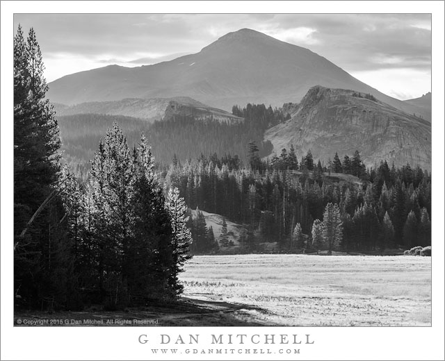
Here, in the final version of the photograph, the darker meadow still seems plenty bright in comparison to other elements in the scene, even though it has been toned down considerably. There is more of the interesting meadow texture and detail there. And notice that the highlights on the trees across the meadow are unaffected by the changes to the meadow.
And, Paul, does that help answer your question? ;-)
Questions or comments? Feel free to leave them below. (Comments are moderated and may not appear immediately.)
© Copyright 2015 G Dan Mitchell – all rights reserved.
 G Dan Mitchell is a California photographer and visual opportunist. His book, “California’s Fall Color: A Photographer’s Guide to Autumn in the Sierra” is available from Heyday Books and Amazon.
Blog | About | Flickr | Twitter | Facebook | Google+ | 500px.com | LinkedIn | Email
All media © Copyright G Dan Mitchell and others as indicated. Any use requires advance permission from G Dan Mitchell.
Discover more from G Dan Mitchell Photography
Subscribe to get the latest posts sent to your email.



Yes sir Dan, you did indeed answer my question… and then some. I’m glad you went into the a little more detail in the explanation of the technique; about “playing” with the curve to get it right for the specific thing needing correction.
Oh, and I like the napkin repro at the top. I had a little chuckle. Its exactly what you drew on that ill fated napkin. Some world changing ideas started on napkins.
I thought you might enjoy my “napkin reproduction,” Paul. ;-)
Dan