Well, I’m getting closer to a determining the finalists for inclusion in my list of favorite 2025 photographs. I’m now down to two dozen, though I’d like to cut the number in half if possible… or at least get it down to 15 or 16.
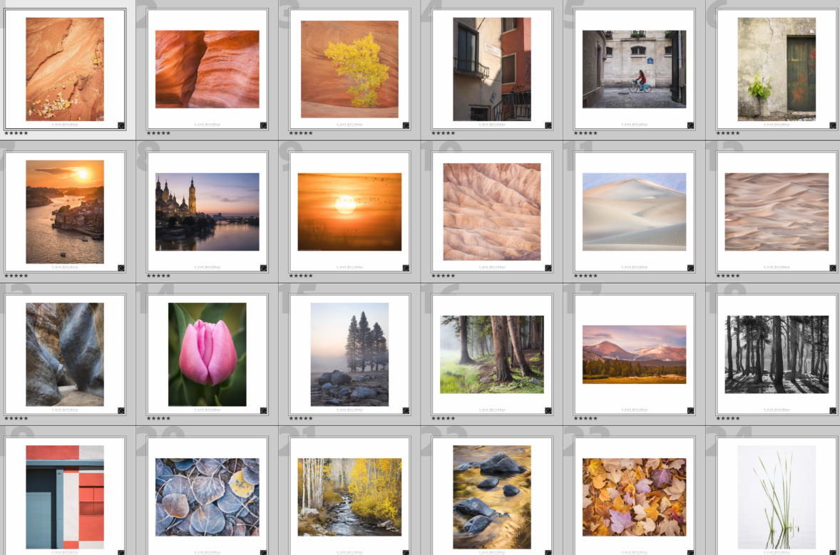
As the number of remaining photographs gets smaller, the decisions become harder! I like all of these, and it is hard to take any of them out of the list — but that’s what I’m going to have to do!
I’d love to hear your thoughts on this almost-final set.
Leave a comment or question using the form. (Click the title to see the full article and to comment if you are viewing it on the home page.)
G Dan Mitchell is a California photographer and visual opportunist. His book, “California’s Fall Color: A Photographer’s Guide to Autumn in the Sierra” (Heyday Books) is available directly from him. Blog | Bluesky | Mastodon | Substack Notes | Flickr | Email
All media © Copyright G Dan Mitchell and others.
Discover more from G Dan Mitchell Photography
Subscribe to get the latest posts sent to your email.
Thanks for taking the time to give me this feedback, Ernie.
I’m always fascinated by the diversity of opinions on these things. Early on in the selection process it is easier to apply almost-objective criteria to the choices, but as the pool shrinks the differences of opinions become wider.
A few things that I consider beyond just whether they are my favorites (all of them are!) or not include the mix of images that I end up with, how they represent my overall photography, and things like color.
For example, there are two sunset photos in there, and if I’m shooting for a dozen or a few more… I don’t want 1/6 of them to be sunset! So one probably needs to go. Since there are still (too) many of my European travel photos, that suggests removing the Porto Sunset photo… even though I like it a lot.
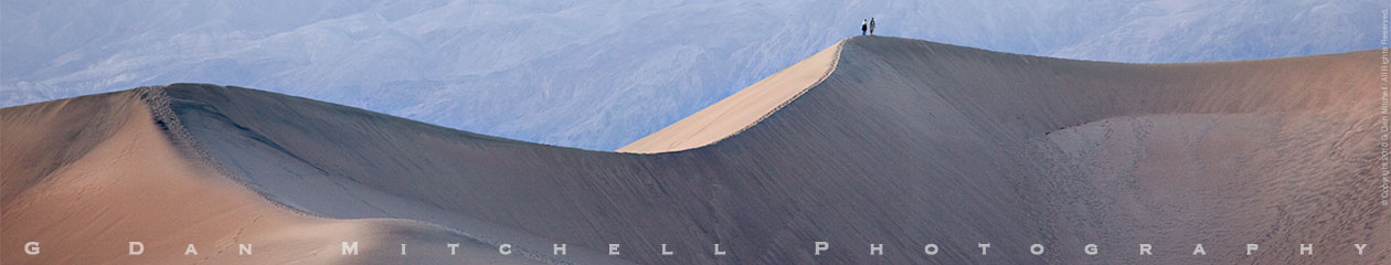
Another example concerns the first and third (in row two) of the Death Valley photographs — while they are technically different subjects (sand dunes and eroded badlands), their color palettes are quite similar and I already have more DEVA photos than I will include in the end.
I’m fascinated by your reaction to the foggy trees photo in row three. It as on my secret “this one gets in no matter what” list! Your comment that it reminds you of “fake pictures” and might be left out for that reason is both interesting and bit troubling! I guess we’re getting to the point where it is no longer “that’s a fake picture” but now “that’s a real picture that looks a bit like what the fake pictures aspire to!”
Dan
Obviously everyone will have differing opinions. That’s fine, everyone is entitled to their opinion.
So, I think I’d eliminate four pictures without much sense of loss (even though all four of them are great pictures).
Row 1, fourth from left, buildings. This one just doesn’t draw me into the building.
Row 2, none
Row 3, first from left, the slot canyon. It just didn’t catch my attention like many other slot canyon pictures do. Fourth picture from the left, tree trunks. Hate to say this, but my eyes & brain make me ask if this is a fake picture. I know it’s not, but with so many fake pictures out there now, that’s what instantly strikes me and keeps coming back. That’s a shame on me because I KNOW it is a real picture that is well composed.
Row 4, first picture, building. It’s a nice picture, I looked at it more than once, I like the juxaposition of the red and blue colors and the arrangement of the beams, but it’s just a building….. I could eliminate it. The two building pictures I left are more interesting to me as in, “Where is the bicyclist going?” and “Look at that very old door!”.
Hope this helps and that you get a lot of comments!