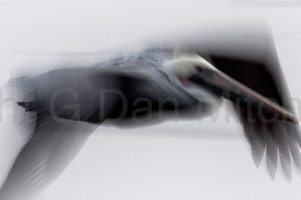
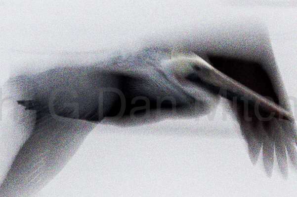
Here are the three source images:


The differences among them are obviously in the amount of noise that was added to the image. No noise was added to the first image – any noise there was in the original capture. 10% level “Uniform” noise was added to the second image in Photoshop. 20% “Uniform” noise was added to the third image in the same way.
The soft photograph was chosen to avoid masking the noise with a lot of other sharp detail – this image provides very smooth gradients from black to white, where noise is typically easier to detect. I also chose this image because it is nearly – but not quite – monochromatic. This meant that I could increase the effect of the noise by using color noise rather than limiting to monochromatic noise – and that the color noise would tend to be more visible against the nearly monochromatic background.
The original set of 6 jpgs includes two from each of the three versions shown here. For last-minute fun you could still visit the comment page and try to a) determine whether or not the differences are visible and b) which pairs of images are the least noisy, more noisy, and most noisy.
More information to come later this evening.
G Dan Mitchell is a California photographer and visual opportunist. His book, “California’s Fall Color: A Photographer’s Guide to Autumn in the Sierra” (Heyday Books) is available directly from him.
G Dan Mitchell: Blog | Bluesky | Mastodon | Substack Notes | Flickr | Email
All media © Copyright G Dan Mitchell and others as indicated. Any use requires advance permission from G Dan Mitchell.
