Earlier today I saw a post in which the author stated that correcting for perspective in post-processing would lead to serious problems:
There is quite a bit of loss in image definition if you do a significant amount of correction for converging verticals in an image editor. You can get far better results with a view camera or a tilt/shift lens. If you only photograph for the web, then maybe the image editor approach is ok, but for reasonably large prints?
While that point of view is widely held and often repeated, in my experience a blanket statement like this is not totally correct – it may come down to the definition of “significant.” I find that in many cases the degradation of the image is so small as to be insignificant or even invisible at 100% magnification, and it is most often completely invisible even in fairly good size prints. (This is not to suggest that those making severe corrections, in architectural photography for example, would not be better served by using a tilt/shift DSLR lens or a MF or LF system.)
Rather than just accepting statements like this, I like to test them. In the past I’ve tested and written about the option of correcting for lens distortions in post- processing: A Test: Correcting Lens Distortion in Post Processing. Here I want to extend this concept to using post-processing techniques for the correction of perspective distortion and for leveling the image.
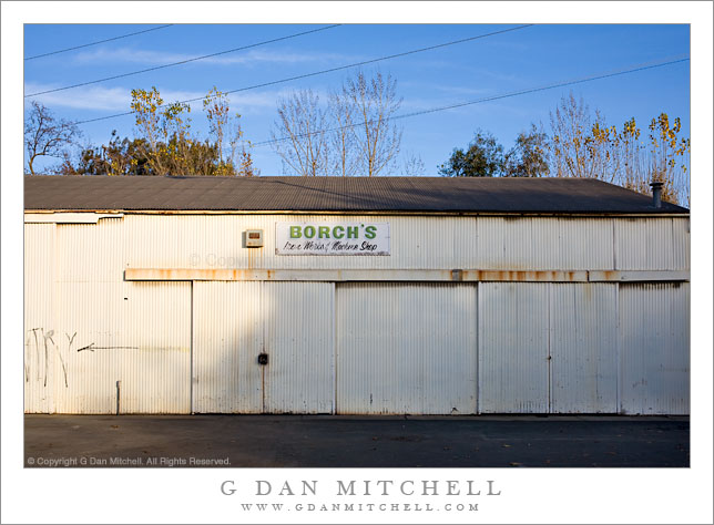
The photograph I’ll use was shot handheld using a full-frame Canon 5D with the EF 35mm f/2 lens, one of my favorites for street photography. First a small version of the final photograph:
Borch’s Iron Works and Machine Shop – old metal shop building in the downtown area of San Jose, California. © Copyright G Dan Mitchell – all rights reserved.
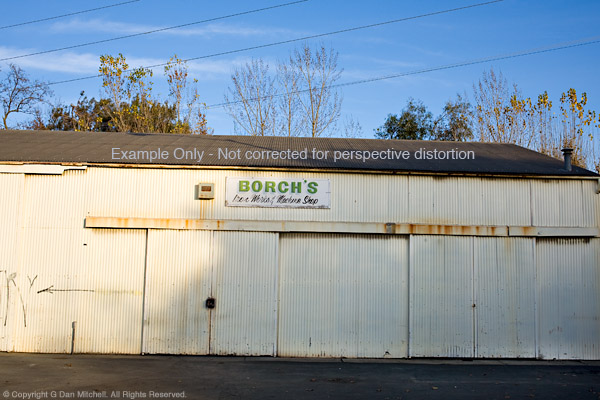
Next is the same image with the same post-processing, except that the corrections to horizontal alignment and perspective have been left out:
Borch’s Iron Works and Machine Shop – old metal shop building in the downtown area of San Jose, California. Uncorrected version. © Copyright G Dan Mitchell – all rights reserved.
Yup, that’s what happens when you shoot street and shoot handheld. ;-)
In this example we can clearly see several problems that need fixing. First, the image is not level – it tilts down to the right. Second, the vertical lines begin to converge toward the top of the image. Third, since the camera’s sensor was not perfectly parallel to the building wall, the right side of the building recedes and gets smaller as the horizontal lines become closer together toward the right edge.
In my view, the uncorrected version of this photograph is not usable. On the other hand, I’m not likely to start doing street photography with a tripod and a tilt shift lens any time soon! Correction in post seems to be a reasonable option. (And, to cut to the chase, the corrected version seen above really does make a nice print.)
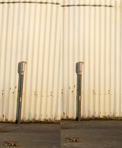
The next image includes two versions of roughly the same section of the photograph at 100% magnification. The crops come from the lower left area of the full image and include the conduit on the wall in the area in full sun. I could have used a section from all the way in the corner, but given the low contrast in that area the difference between the samples would be even harder to see – so I’ll stick with the section where the conduit provides a more visible contrast and frame of reference. Depending on your monitor, this resolution is equivalent to looking at a small section from a print that would be perhaps 50″ or 60″ wide. (Hint: that would be a very big print for a DSLR original – significantly larger than almost anyone ever produces! Made many 60″ x 40″ prints recently?)
100% magnification from lower left area of ‘Borch’s Iron Works and Machine Shop’ – two versions. © Copyright G Dan Mitchell – all rights reserved.
I believe that if you know what to look for and you inspect this 100% crop very closely you can detect a small difference in the “sharpness” of the two photographs – but it is quite subtle even when viewed at 100%. In practical terms, however, this tiny effect that is just barely visible under close inspection at 100% in side-by-side comparisons on the screen is entirely insignificant in a print. Even with a very close inspection it would be quite invisible in a print of, say, 18″ x 24″ and probably even larger. Bottom line: Both would produce very sharp prints at very large sizes and essentially no one would comment that one is sharper than the other… though quite a few might notice that the corrected image looks a whole lot less distorted in the spatial sense.
Note: Article text edited/updated for clarity on 4/27/13.
This reinforces my belief that any degradation to the image quality that occurs when lens distortion, perspective, and/or horizontal level are corrected carefully during the post-processing stage can be very minimal and in the majority of situations will be invisible in prints.
G Dan Mitchell is a California photographer and visual opportunist. His book, “California’s Fall Color: A Photographer’s Guide to Autumn in the Sierra” is available from Heyday Books and Amazon.
Blog | About | Flickr | Facebook | Email
Links to Articles, Sales and Licensing, my Sierra Nevada Fall Color book, Contact Information.
All media © Copyright G Dan Mitchell and others as indicated. Any use requires advance permission from G Dan Mitchell.