Yesterday I posted “Experiment #2: What do you see?,” in which I shared six image files comprised of three identical pairs of images and asked volunteers a) whether they saw any differences among them when viewed in their web browsers, b) to describe any differences that they noticed, and c) to try to identify the pairs of identical images. As describe in the original post, all of the images came from the very same source file – e.g from a single exposure – and were processed identically with the exception of one variable that was not identified.
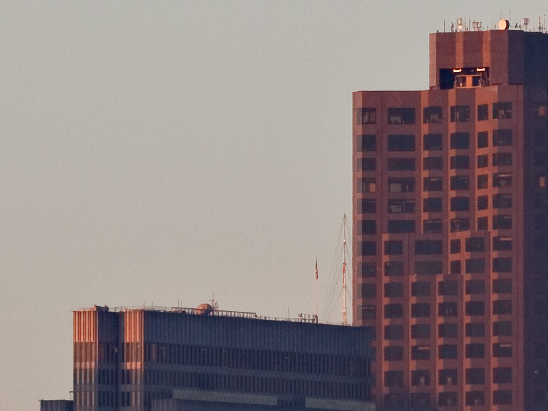
Here are the 100% magnification crops from the three source images:
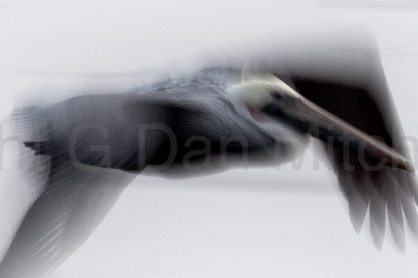

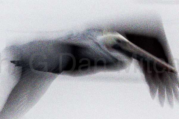
The differences among them are obviously in the amount of noise that was added to the image. No noise was added to the first image – any noise there was in the original capture. 10% level “Uniform” noise was added to the second image in Photoshop. 20% “Uniform” noise was added to the third image in the same way.
While I could have varied camera ISO to produce actual camera-generated noise, doing so would have also produced other variations in the images that would have given secondary and possibly misleading cues as to the differences between images. This most certainly would have affected part c) of “the question” as outlined above. While recognizing that noise added in post is not going to be exactly the same as noise produced in camera, I did try to ensure that the noise would at least be of a type and level that would clearly cause concern if the camera did produce it.
The soft photograph was chosen to avoid masking the noise with a lot of other sharp detail – this image provides very smooth gradients from black to white, where noise is typically easier to detect. I also chose this image because it is nearly – but not quite – monochromatic. This meant that I could increase the effect of the noise by using color noise rather than limiting to monochromatic noise – and that the color noise would tend to be more visible against the nearly monochromatic background.
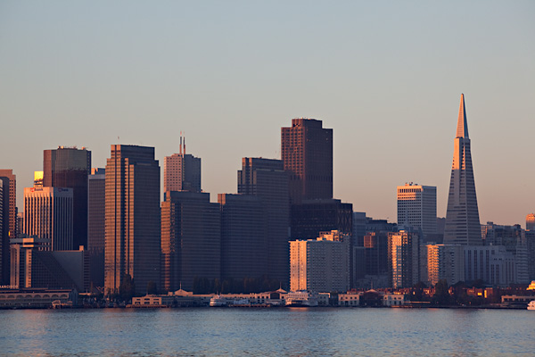
While quite a few folks reported that they didn’t see any difference among the image when viewed in their web browsers – and, frankly, this did not surprise me – some did report noting differences. Test subjects have been known to both correctly identify real differences… and to think they have seen real differences where none existed. With that possibility in mind, I was interested to see how accurate the “perceptions of difference” might be, hence the challenge to find the pairs of identical images. The idea here is that if one can really see differences between images that one should then be able to categorize the images accurately based on those differences. I won’t comment here on whether any individuals were right or wrong, but here are the six images grouped as identical pairs.
No noise added:
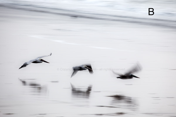
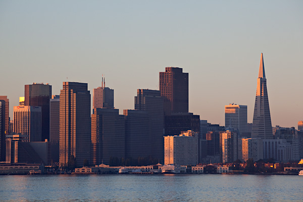
10% noise added:


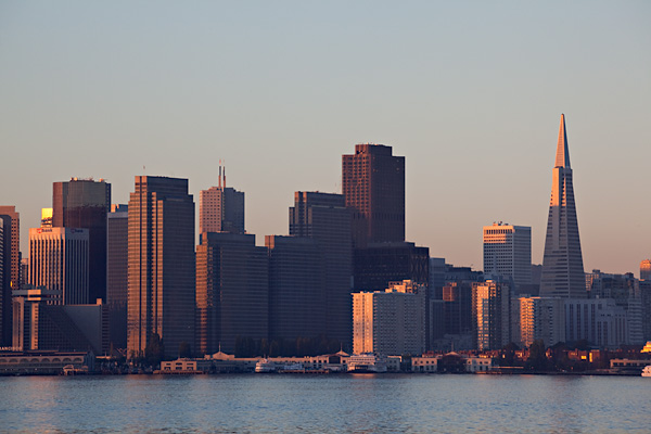
20% noise added:

A good number of readers asked, “What is the point?” A few even were upset at a test of something they regard as settled – e.g. that noise and other small artifacts become imperceptible when a large image is reduced to typical web sizes. (In this case each pixel in the jpgs is the average of close to 100 pixels in the original file.) However, I can say for sure that this issue is not resolved in the minds of all photographers nor in the minds of many who are making purchase decisions about cameras for themselves or for others.
My thesis was essentially that very significant amounts of noise that would be clearly visible in large original files at 100% magnification will be indistinguishable from files that have far less noise but are otherwise identical when the files are reduced for typical web site use.
A direct “point” might simply be that if you reduce 21MP full frame photographs containing large amounts of noise to 600 pixel width high quality jpg files viewers of the images on the web seem unable to reliably notice the differences in noise levels. You could reasonably extrapolate from this that if your main reason for shooting photographs is to share them on the web, noise levels in the camera may not be an important decision point for you as you shop. Though you cannot extrapolate the following directly from this test, I believe that shooters who mainly share jpg images or perhaps make letter-size prints will not see any significant image quality benefits from getting really high-end cameras. If noise levels as different as those found in this experiment cannot be discerned then the quite small differences in noise between two brands or models of camera are likely to be completely insignificant in images viewed online at typical dimensions. (If you make very large prints on a regular basis then your issues will be different.)
For my part, even though I created the images, I cannot reliably tell them apart by looking at them! When I look up my record of which image was treated which way I think I can see the difference, but I’m pretty certain that if I had to try to pair the identical images I would be unsuccessful. (Note: if you view the images one above other on this page you will think they are different due to viewing angle differences on your monitor. Go to the original post to see them displayed successively in the same location on the screen.)
(Experiment #1 tried something similar, though in that case the variable was the “sharpness” of the original image file.)