Today Nikon announced two new 36+MP full frame DSLRs, the D800 and D800E, and Canon announced a long-awaited update to their EF 24-70mm f/2.8 L zoom. I’ve posted a bit more information in a new entry on the Deals page.
G Dan Mitchell is a California photographer whose subjects include the Pacific coast, redwood forests, central California oak/grasslands, the Sierra Nevada, California deserts, urban landscapes, night photography, and more. Blog | About | Flickr | Twitter | Facebook | Google+ | 500px.com | LinkedIn | Email
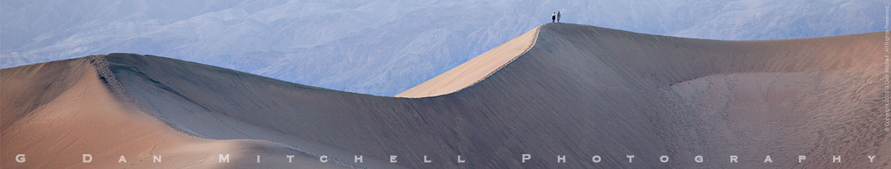
The image I posted earlier today both here at the blog and on Google+ got me thinking about the various ways that a photograph can “come to life.” This particular image followed a path that several other images that I consider to be among my best followed – namely, it languished in my raw file archive for nearly a year before I rediscovered it recently while going back through the old files. I recognized this pattern some time ago, and I now make it a habit to revisit all of my (thousands and thousands of) raw files about a year after I shoot them.
Why didn’t I “see” this image when I first reviewed raw files right after the shoot? I’m not entirely certain, but several ideas come to mind. Sometimes at the time of the shoot I have a strongly fixed notion of how I want to portray the subject , and as I shoot I’m already categorizing exposures by how well they correspond to this preconception. So when I initially go through the raws I may be mostly looking for what fits my expectations as opposed to looking objectively at what works on its own merits. Coming back a year later allows me to better see the image for what it is, without having my judgment so affected by prior expectations.
Related to this is the sheer number of images and how one deals with them in the post-processing workflow. I may begin with what I think are the most promising couple of images from a shoot and then take them all the way to a print-ready (or actually printed) stage. Once I’ve done that with the first selects from a given subject, I’m more likely to move on to other subjects – and potentially leave other good images in the dust.
There is a lot more to say about this, I think, but I’ll save the longer explication for another blog post in the future. Does anyone else make a practice of doing a full review of raw files at some future date?
I read (yet another… ;-) megapixel rant somewhere online yesterday, and it got me thinking again about the fixation on megapixels as a measure of camera “value,” and the odd and sometimes irrational ways that people respond to this issue. It is well known that over the past decade or more, as digital photography technologies have become more and more prevalent (displacing film in many areas), camera technology has continued to advance in many ways. Among these advances is the ability to increase the number of photosites on sensors of a given size – e.g. give us “more megapixels.”
It is typical for photographic “how to” books to focus on specific techniques, and to be organized around a presentation of these techniques – perhaps with a section on curves, a section on black and white conversion, and so forth. This approach has its place, especially for certain types of learners and at certain points in the learning process. It is important to understand the basic techniques and operations that are available in the “digital darkroom” of such programs as Photoshop, Lightroom and so forth. That said, the bigger and more important issue is how to call upon these techniques creatively and effectively and appropriately in order to make photographs. Not all “how to” books do an effective job of illustrating this.
Michael’s “Light & Land” takes a different approach, and one that more accurately and realistically reflects the thought process of a photographer who is calling upon this arsenal of techniques in the service of creating beautiful photographs. He writes:
“The digital darkroom gives us tremendous control over our images. We can make them lighter, darker, add contrast, change the color balance, increase saturation, turn a color photograph into black and white, remove telephone poles, blend exposures with HDR, combine ten images to capture infinite depth of field, or put a winged elephant in the sky.
Photographer and visual opportunist. Daily photos since 2005, plus articles, reviews, news, and ideas.
Manage Consent
To provide the best experiences, we use technologies like cookies to store and/or access device information. Consenting to these technologies will allow us to process data such as browsing behavior or unique IDs on this site. Not consenting or withdrawing consent, may adversely affect certain features and functions.
Functional
Always active
The technical storage or access is strictly necessary for the legitimate purpose of enabling the use of a specific service explicitly requested by the subscriber or user, or for the sole purpose of carrying out the transmission of a communication over an electronic communications network.
Preferences
The technical storage or access is necessary for the legitimate purpose of storing preferences that are not requested by the subscriber or user.
Statistics
The technical storage or access that is used exclusively for statistical purposes.The technical storage or access that is used exclusively for anonymous statistical purposes. Without a subpoena, voluntary compliance on the part of your Internet Service Provider, or additional records from a third party, information stored or retrieved for this purpose alone cannot usually be used to identify you.
Marketing
The technical storage or access is required to create user profiles to send advertising, or to track the user on a website or across several websites for similar marketing purposes.