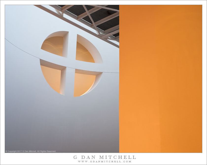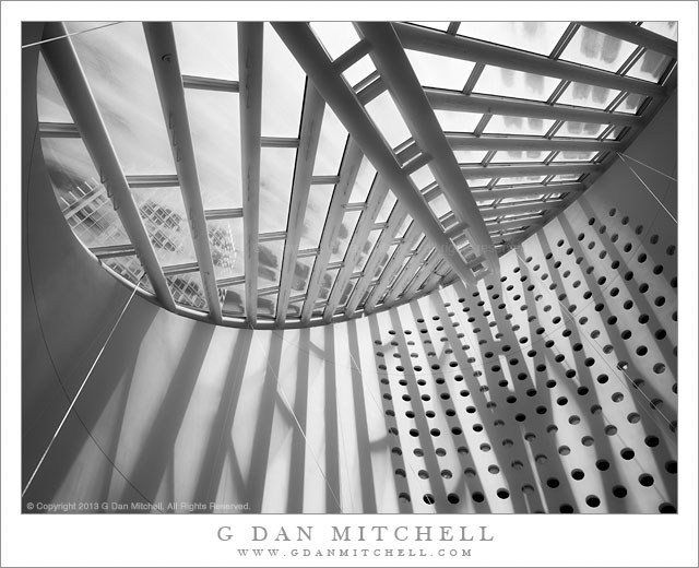
Interior, SFMoMA. San Francisco Museum of Modern Art, California. January 3, 2017. © Copyright 2017 G Dan Mitchell – all rights reserved.
Interior photograph of San Francisco Museum of Modern Art
In the wake of the major expansion and remodel of the San Francisco Museum of Modern Art (SFMoMA), the feeling of the place has changed. Overall I think that the changes are almost universally for the better, and it seems to me that the new space in the tall and narrow “addition” to the rear of the original building works quite well. (I have a few quibbles — including some back galleries that include audio in their exhibits but are not acoustically isolated sufficiently.) The feeling is mostly open and bright, which I think works well for modern art.
The feeling of the original front portion of the building is somewhat as it was, but it has changed, too. The ground level was originally designed to function as a main entrance and assembly space, but now much of that has been moved further back into the new building. The central atrium is still there, with stairs winding around its space, and lit from above by the light coming through the “oculus” at the top that faces to the west. I’m always intrigued by the shapes and colors and light in this space and the way that geometrical forms warp along its curved surface.
 G Dan Mitchell is a California photographer and visual opportunist. His book, “California’s Fall Color: A Photographer’s Guide to Autumn in the Sierra” is available from Heyday Books and Amazon.
Blog | About | Flickr | Twitter | Facebook | Google+ | LinkedIn | Email
All media © Copyright G Dan Mitchell and others as indicated. Any use requires advance permission from G Dan Mitchell.


