For those of you sitting on the fence about getting a copy of Adobe Lightroom, you might think about acting now – B&H is offering Lightroom at 50% off for 24 hours only. Unless you have access to the academic pricing, this is as low as I’ve seen the price go.
Tag Archives: photoshop
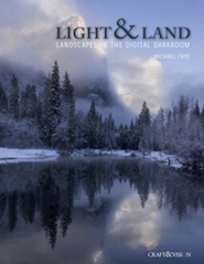
Review: “Light & Land” by Michael Frye
Over the past few weeks I have had the chance to go through Michael Frye’s new ebook, “Light and Land: Landscapes in the Digital Darkroom.” Many are no doubt already aware of Michael’s reputation from his photography, his workshops, and his other publications including his “Photographer’s Guide to Yosemite” and “Digital Landscape Photography: In The Footsteps of Ansel Adams and the Masters.” I have the .pdf version of “Light and Land”, and I understand that an iPad app version may also be available.
It is typical for photographic “how to” books to focus on specific techniques, and to be organized around a presentation of these techniques – perhaps with a section on curves, a section on black and white conversion, and so forth. This approach has its place, especially for certain types of learners and at certain points in the learning process. It is important to understand the basic techniques and operations that are available in the “digital darkroom” of such programs as Photoshop, Lightroom and so forth. That said, the bigger and more important issue is how to call upon these techniques creatively and effectively and appropriately in order to make photographs. Not all “how to” books do an effective job of illustrating this.
Michael’s “Light & Land” takes a different approach, and one that more accurately and realistically reflects the thought process of a photographer who is calling upon this arsenal of techniques in the service of creating beautiful photographs. He writes:
“The digital darkroom gives us tremendous control over our images. We can make them lighter, darker, add contrast, change the color balance, increase saturation, turn a color photograph into black and white, remove telephone poles, blend exposures with HDR, combine ten images to capture infinite depth of field, or put a winged elephant in the sky.
But what do we do with these choices?” Continue reading Review: “Light & Land” by Michael Frye
How I Sharpen – An Overview
(I originally wrote this article way back in 2009. Some portions were revised in February 2019 to reflect changes to sharpening tools and some different ideas I have developed regarding sharpening settings. It was updated and modified again in 2023.)
I just posted something elsewhere about how I sharpen for prints and I figured I’d get some extra mileage out of it by posting it here as well. First, few disclaimers…
- The title of this article originally referred to a “quick overview.” Clearly, it is too long for that! But there are whole books on sharpening, so by contrast I think this qualifies as a quick description. In fact, I’ve left a lot out of the description!
- There are people with far more expertise on this topic than I have, and I have no illusions that this description represents the “right” way to do this, much less the “best” way!
The subject of how to sharpen photographs in post for print or electronic output is one that confuses many people… and a subject to which many books, online articles, and forums posts have been devoted. There are any number of ways to get the desired results via sharpening, and different techniques are called for depending upon taste, the nature of the image, and the final form of presentation: size? print? jpg? etc…
Here is a general description of what I do when I print. I’ve left some variations out of this description. The description also covers software that I use in my workflow — you might prefer something different, but you might still be able to adapt these ideas. You’ll note at least one controversial method later in the list, but try it before you dismiss it. The approach I use could well be “over-kill” if you just want to pump out a bunch of jpgs to share with friends and family or if you want to make some small prints — my end goal is good sized prints, and I work on each one rather carefully rather than mass-processing them and printing a bunch at one time.
And please understand that I’m most certainly not implying that my way is the right way. It works for me, and that people who view my prints often remark on their sharpness and detail. (And a few other things, too, I hope! :-)
Reader question: How to add borders to online photographs
From time to time people ask what techniques I use to create the simple frames for versions of my photographs that I post online. A while ago I wrote about this: Creating Frames for Online Photos: My Method. The explanation involves the use of Photoshop CS3, but the technique is essentially the same in the current version of the program.
You can read the details at the link above, but the process is basically fairly straightforward. I use Image –> Canvas size to add a series of borders to the original image: a one-pixel gray border immediately around it, a larger white border beyond that with a bit more width at the bottom, and finally a one-pixel black border at the outer edge. I turn this into an action that I can apply by selecting it and clicking a button to run it.
The approach to creating the text incorporated into the web images is similar, though it requires a bit of tweaking with each photograph. Essentially, I create three text layers: one for the large type at the bottom, one for the small embedded copyright notice, and a slightly larger “watermark” that will go over the image itself. The action I recorded creates the three layers and inserts the boilerplate text, but I always have to do a bit of alignment manually, and I may also have to make some decisions about opacity and so on depending upon the characteristics of the individual image. Still, it takes less than a minute to do the whole thing even in the wost cases.
Why apply a border, “branding” text, and copyright to the photographs?
- If people like your photograph, it makes sense to make it easy for them to find you – so I include the easily readable text with my name and web site URL. No matter where the unaltered file ends up, viewers will be able to find the source.
- The use of consistent presentation helps to establish the photographer’s “brand.” This is true even when the image is displayed in ways that are out of your control, including search engine results.
- Inclusion of the copyright information is a formality to remind viewers that use of my photographs requires advance permission.
- Although the inclusion of a watermark cannot stop a dedicated image thief, I think it reduces the likelihood of misappropriation – and that is probably about all that one can really hope for on the basis of a watermark. It may tweak the conscience of the typical user, who may perhaps simply not have thought about the issues of legal usage, and it may encourage others to look for a different image that won’t expose their illegal use and/or require them to take the intentional step of trying to remove the text to cover up the source.
- Concerned About Image Theft
- How to Add Borders to Online Photographs
- One Lens for Landscape and Wildflowers on Hikes
- Yosemite in October?
- DSLR Sensor Cleaning
- About Sharpness and Detail
- Camera Stability and Long Lenses
- Photographing in the Rain
- Landscape Lenses
- About Depth of Field
G Dan Mitchell is a California photographer and visual opportunist. His book, “California’s Fall Color: A Photographer’s Guide to Autumn in the Sierra” is available from Heyday Books and Amazon.
Blog | About | Flickr | Twitter | Facebook | Google+ | 500px.com | LinkedIn | Email
All media © Copyright G Dan Mitchell and others as indicated. Any use requires advance permission from G Dan Mitchell.