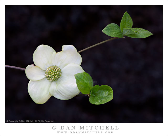
Dogwood Bloom and Leaves. Yosemite Valley, California. May 7, 2011. © Copyright G Dan Mitchell – all rights reserved.
An early dogwood blossom and leaves in Yosemite Valley, California.
There is not a lot to add to the previous post that came along with the black and white version of this photograph – but for anyone who didn’t see the earlier post I’ll offer a short description. I had been at the Ansel Adams Gallery reception for Michael Fry’s exhibit there in the middle of the afternoon, and after a very enjoyable hour and a half or so viewing his wonderful prints and schmoozing with various folks who came for the reception, I decided to wander off to the east along the base of the north walls of Yosemite Valley, at first heading in the general direction of the Ahwahnee Hotel. Near there I stopped at a tree that I have photographed previously, when I shot the autumn colors of the leaves draped across a large boulder. The new flowers were just starting to appear, so I climbed up on the boulder and spent some time photographing before continuing my wandering out towards the Merced River.
G Dan Mitchell Photography | Flickr | Twitter (follow me) | Facebook (“Like” my page) | LinkedIn | Email
Text, photographs, and other media are © Copyright G Dan Mitchell (or others when indicated) and are not in the public domain and may not be used on websites, blogs, or in other media without advance permission from G Dan Mitchell.
Discover more from G Dan Mitchell Photography
Subscribe to get the latest posts sent to your email.


This is beautiful and simplistic, the configuration of the leaves and bloom is wonderful. I like the black and white but I do tend to prefer the color version. Very nice piece!
Thanks for your comment and your kind words, Curt. I keep going back and forth between the two versions. I have not had a chance to make prints yet, and that may be the deciding factor.
Dan
Melli, your point does make sense. It is not uncommon for me to like both BW and color versions of some photographs, and occasionally I have to live with both for a while before I develop a strong preference.
Dan
I actually prefer the colored version of it. It feels more lively to me. Love the minimalism in the composition, but I think the green of the leaves are better able to guide the eye in this composition vs. the monochrome one. If that makes any sense at all. :)