Category Archives: Photographs: Architecture

Apartments, Driveway, Dusk

Apartments, Driveway, Dusk
Security lights illuminate the driveway of an urban apartment complex, Pasadena

Apartments, Driveway, Dusk. Pasadena, California. January 6, 2017. © Copyright 2017 G Dan Mitchell – all rights reserved.

Security lights illuminate the driveway of an urban apartment complex, Pasadena

Landscape photographers are well away of the qualities of light during the short period leading up to sunset, and with the rapidity of the changes to that light. But something similar happens for photographers of the “urban landscape,” as well, though it tends to be most pronounced immediately after sunset rather than just before. There is a short period of perhaps a half hour or less when the ambient natural light is somewhat in balance with artificial light. During this period the natural light has diminished to the point that things appear more like night than day, but there is still enough natural light around to fill shadows and illuminate areas that are not covered by artificial light. (A bit later and the artificial lighting is virtually the only light source in most cases, and the range between light and shadow can be quite large.)

It was close to the beginning of such a time when I made this photograph of a parking lot and group of apartment buildings while walking around in Pasadena during the first week of the new year. A bit earlier and the lights either would not have been on or would not have been visible. A bit later and the foreground shadows would be completely black. It is a bit difficult to say precisely what attracted me to this scene — perhaps the bit of light spilling around the corner of the wall at left, perhaps the lovely yellowing light on the garage doors, maybe the geometry of the buildings… or perhaps the sum of all these things and more.


G Dan Mitchell is a California photographer and visual opportunist. His book, “California’s Fall Color: A Photographer’s Guide to Autumn in the Sierra” is available from Heyday Books and Amazon.
Blog | About | Flickr | Twitter | FacebookGoogle+ | LinkedIn | Email


All media © Copyright G Dan Mitchell and others as indicated. Any use requires advance permission from G Dan Mitchell.

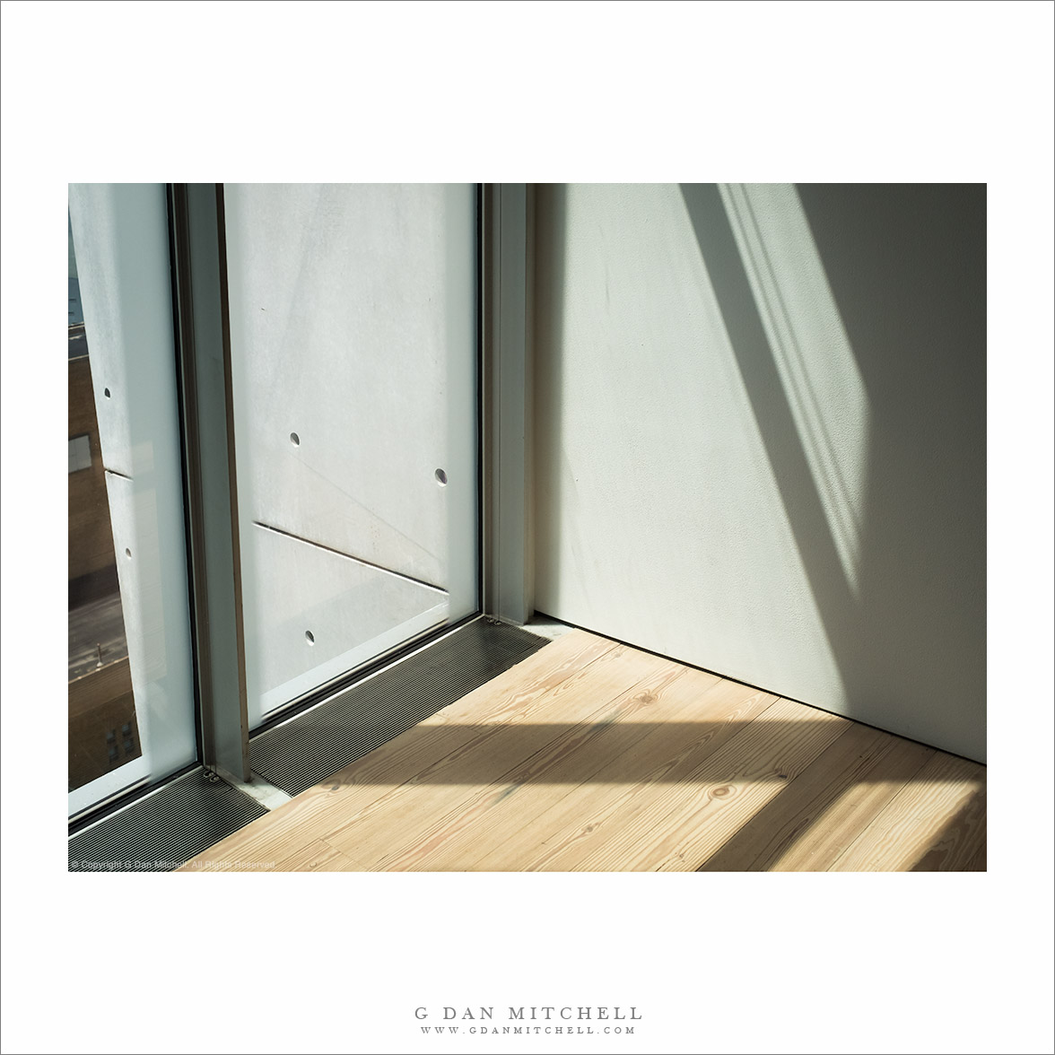
Detail, Atrium

Detail, Atrium
Architectural details of atrium of the San Francisco Museum of Modern Art

Detail, Atrium. San Francisco, California. January 3, 2016. © Copyright 2017 G Dan Mitchell – all rights reserved.

Architectural details of atrium of the San Francisco Museum of Modern Art

When I visit museums I often photograph them. I don’t usually photograph the displays, but I do photograph the architecture, people, and sometimes the structural abstractions I can locate. The San Francisco Museum of Modern Art is a favorite museum — for its collection, its temporary installations (Right now go see William Kentridge’s “The Refusal of Time!”)

The museum was recently remodeled and expanded, with a new wing added to the original structure. The original centerpiece of the interior architecture was the atrium, a tall central open space topped by a “turret gallery” with a catwalk. The atrium remains following the remodel, and the light in this space is often spectacular, ranging from shade to bright sunshine. During this visit the light was softened by rainy conditions outside, and the colors ranged from the warmth of electrical lighting to the cool blues of the cloud-muted light coming in through the windows.


G Dan Mitchell is a California photographer and visual opportunist. His book, “California’s Fall Color: A Photographer’s Guide to Autumn in the Sierra” is available from Heyday Books and Amazon.
Blog | About | Flickr | Twitter | FacebookGoogle+ | LinkedIn | Email


All media © Copyright G Dan Mitchell and others as indicated. Any use requires advance permission from G Dan Mitchell.

Florence Building

Florence Building
A gritty looking Florence building

Florence Building. Florence/Firenze, Italy. August 28, 2016. © Copyright 2016 G Dan Mitchell – all rights reserved.

A gritty looking Florence building

It was almost the end of our five weeks of American, British, and European travel this past August — from New York City in late July to the UK at the start of August, and then through Paris, Heidelberg, and several areas in Italy. The trip was winding down. Truth be told, we were at the point where we would have been happy to continue traveling, but it was time to return to the US and get back to the so-called real world.

We went out for a morning walk in Florence, heading away from the busiest areas in the opposite direction from our hotel. We wandered up narrow streets to a large, open square, and then simply “random walked” our way back. For an American, particularly a west coast American perhaps, central Florence is a remarkably different looking place. This is not just because of the very old streets and buildings but secondarily because of the state of their exteriors. In many places things are very similar colors, in a range between brown and tan, and most buildings don’t look all that fancy from the outside. There is a striking lack of advertising signs — a shop might typically have one sign and it probably isn’t lit much if at all. This building had a practical look about it, with pipes, wires, and conduit on the outside. The light was remarkable — an unusual combination of brilliance combined with a certain softness that the Italian atmosphere provided almost the entire time we were there.


G Dan Mitchell is a California photographer and visual opportunist. His book, “California’s Fall Color: A Photographer’s Guide to Autumn in the Sierra” is available from Heyday Books and Amazon.
Blog | About | Flickr | Twitter | FacebookGoogle+ | LinkedIn | Email


All media © Copyright G Dan Mitchell and others as indicated. Any use requires advance permission from G Dan Mitchell.

Musée d’Orsay, Interior

Musée d'Orsay, Interior
The main interior area of the Musée d’Orsay, Paris

Musée d’Orsay, Interior. Paris, France. August 12, 2016. © Copyright 2016 G Dan Mitchell – all rights reserved.

The main interior area of the Musée d’Orsay, Paris

Even though we had almost a week in Paris this past summer, there was simply too much to see — not that this was a surprise! We knew that there were certain things that we simply had to see, and we knew that we wanted to visit several museums, some small and some large. We visit a small photography museum one day, and we visited a portion of the Louvre on another, but there were other things to see and do as well.

All of this is to explain our unfortunately brief visit to Musée d’Orsay, which we only managed to get to near the end of our trip, and then on an afternoon when the place was only going to be open a few more hours. We went in and rushed to see at least a few things that we knew we did not want to miss, and I found time to make just a few photographs, including this one of the airy interior of the building just before it closed.


G Dan Mitchell is a California photographer and visual opportunist. His book, “California’s Fall Color: A Photographer’s Guide to Autumn in the Sierra” is available from Heyday Books and Amazon.
Blog | About | Flickr | Twitter | FacebookGoogle+ | LinkedIn | Email


All media © Copyright G Dan Mitchell and others as indicated. Any use requires advance permission from G Dan Mitchell.