Tag Archives: border

Tree and Shadow’s Edge

Tree and Shadow's Edge
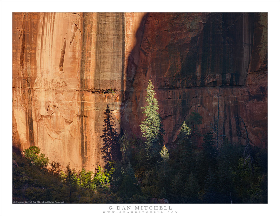
A border between light and shadow moves across a tree at the base of a sandstone cliff, Zion National Park.

Tree and Shadow’s Edge. © Copyright 2021 G Dan Mitchell – all rights reserved.

A border between light and shadow moves across a tree at the base of a sandstone cliff, Zion National Park.

Sometimes (oh, heck, often) photographs come about in somewhat unsuspected ways, and this is such a photograph. In October we were in Southern Utah and we had previously spent a day photographing in Zion Canyon. The general plan on this day was to photograph along Mt. Carmel Highway in the morning (which we did), grab some coffee and food beyond the park, and then, well, we weren’t quite sure. The day evolved organically and we ended up on some interesting Utah backroads crossing some surprisingly snowy highland before we eventually ended up in Cedar City. We gassed up the vehicle and realized that we had time for a quick side trip into Kolob Canyon on our way back toward our eventual destination.

I’ve been in the less-visited and less-developed section of Zion National Park several times. In addition to being a jumping off point for lots of interesting trails, it presents some landscapes opportunities that are quite different from those of the more familiar Zion Canyon. I’ve usually been there earlier in the day, so it was fascinating to observe the place in late-day light. Much of this landscape is huge, even “epic” in scale, but as I scanned it I started to see smaller vignettes that seemed interesting. In particular, I noticed that this shadow was moving from left to right and gradually lighting the prominent tree in the center of the scene, casting its shadow on the brightly-lit sandstone behind it.


G Dan Mitchell is a California photographer and visual opportunist. His book, “California’s Fall Color: A Photographer’s Guide to Autumn in the Sierra” is available from Heyday Books, Amazon, and directly from G Dan Mitchell.

Blog | About | Flickr | FacebookEmail

Links to Articles, Sales and Licensing, my Sierra Nevada Fall Color book, Contact Information.

Scroll down to leave a comment or question.


All media © Copyright G Dan Mitchell and others as indicated. Any use requires advance permission from G Dan Mitchell.

Reader question: How to add borders to online photographs

From time to time people ask what techniques I use to create the simple frames for versions of my photographs that I post online. A while ago I wrote about this: Creating Frames for Online Photos: My Method. The explanation involves the use of Photoshop CS3, but the technique is essentially the same in the current version of the program.

You can read the details at the link above, but the process is basically fairly straightforward. I use Image –> Canvas size to add a series of borders to the original image: a one-pixel gray border immediately around it, a larger white border beyond that with a bit more width at the bottom, and finally a one-pixel black border at the outer edge. I turn this into an action that I can apply by selecting it and clicking a button to run it.

The approach to creating the text incorporated into the web images is similar, though it requires a bit of tweaking with each photograph. Essentially, I create three text layers: one for the large type at the bottom, one for the small embedded copyright notice, and a slightly larger “watermark” that will go over the image itself. The action I recorded creates the three layers and inserts the boilerplate text, but I always have to do a bit of alignment manually, and I may also have to make some decisions about opacity and so on depending upon the characteristics of the individual image. Still, it takes less than a minute to do the whole thing even in the wost cases.

Why apply a border, “branding” text, and copyright to the photographs?

  • If people like your photograph, it makes sense to make it easy for them to find you – so I include the easily readable text with my name and web site URL. No matter where the unaltered file ends up, viewers will be able to find the source.
  • The use of consistent presentation helps to establish the photographer’s “brand.” This is true even when the image is displayed in ways that are out of your control, including search engine results.
  • Inclusion of the copyright information is a formality to remind viewers that use of my photographs requires advance permission.
  • Although the inclusion of a watermark cannot stop a dedicated image thief, I think it reduces the likelihood of misappropriation – and that is probably about all that one can really hope for on the basis of a watermark. It may tweak the conscience of the typical user, who may perhaps simply not have thought about the issues of legal usage, and it may encourage others to look for a different image that won’t expose their illegal use and/or require them to take the intentional step of trying to remove the text to cover up the source.
I also addressed these issues in a separate post at this blog.
(Occasionally a person interested in purchasing a print or licensing a photograph for some other use wonders if the embedded watermarks, copyright information, and branded borders are part of the original images. No. When you purchase a print there is nothing on the paper but the photograph itself and my signature. Photos licensed for other uses – books, magazines, web site, etc – are normally provided without added text.)
Articles in the “reader questions” series:

G Dan Mitchell is a California photographer and visual opportunist. His book, “California’s Fall Color: A Photographer’s Guide to Autumn in the Sierra” is available from Heyday Books and Amazon.
Blog | About | Flickr | Twitter | FacebookGoogle+ | 500px.com | LinkedIn | Email


All media © Copyright G Dan Mitchell and others as indicated. Any use requires advance permission from G Dan Mitchell.