Tag Archives: sfmoma

Inside The Oculus

Inside The Oculus
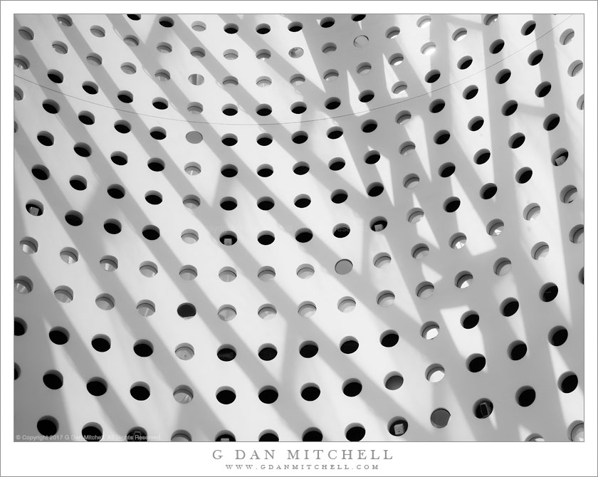
Play of midday light and shadows on the walls of the Oculus, SFMOMA

Inside The Oculus. San Francisco Museum of Modern Art. July 13, 2017. © Copyright 2017 G Dan Mitchell – all rights reserved.

Play of midday light and shadows on the walls of the Oculus, SFMOMA

This week we made a visit to the San Francisco Museum of Modern Art (SFMOMA) to see and hear the Soundtracks exhibit, which presents objects and installations of sonic art of various sorts. To be honest, I wasn’t that hopeful about this exhibit — I’ve often found that many visual artist’s ideas about sound art can be naive and banal in too many cases. However, the exhibit was (is, and you should go) excellent, with a wide variety of work that is interesting in a range of ways.

In any case, virtually every visit to this museum is also an excuse to make at least a few photographs, often of the architecture of the place. The central “Oculus” structure (which housed one of the sonic art pieces, too) is interesting to me as much for the play of light and shadows on its curved walls as it is for its own architectural form. I have photographed it many times, but being so close to the summer solstice the shadows took on different qualities than I had seen before. Here shadows from the structure of the upper window fall across a curved wall that is perforated by a pattern of large holes.


G Dan Mitchell is a California photographer and visual opportunist. His book, “California’s Fall Color: A Photographer’s Guide to Autumn in the Sierra” is available from Heyday Books and Amazon.
Blog | About | Flickr | Twitter | FacebookGoogle+ | LinkedIn | Email


All media © Copyright G Dan Mitchell and others as indicated. Any use requires advance permission from G Dan Mitchell.

Building In Muted Light

Building In Muted Light
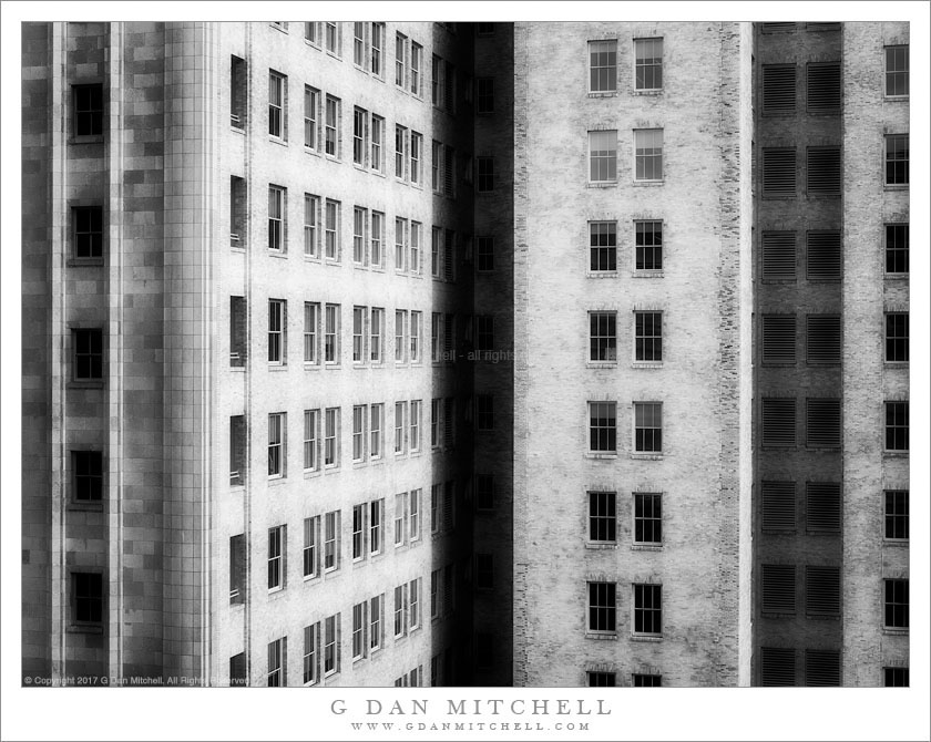
Cloud-muted light on an urban building near SFMOMA

Building In Muted Light. San Francisco, California. February 3, 3017. © Copyright 2017 G Dan Mitchell – all rights reserved.

Cloud-muted light on an urban building near SFMOMA

This building is becoming something of a theme for me, and I often end up treating it in black and white. I made the photograph from one of the outdoor terraces high on the side of the new section of the San Francisco Museum of Modern Art (SFMOMA), from which there are interesting and varied views of the surrounding downtown San Francisco neighborhood. This building is perhaps the closest to the museum, and its form and the texture of its surface are interesting.

I originally thought that it would be a color photograph. The soft light played in interesting ways on the subtle colors of the stone and the pastel color of the windows. But the more I worked on it the more something persuaded me to let go of that nod to realism and instead go with a rather highly processed monochrome interpretation. There is a school of architecture photography that makes heavy use of techniques that darken areas of the image and then compensate by selective lightening. This is often complemented by some techniques involving blur — a sort of masking effect. I used these and more, including some heavy dodging and burning to get this photograph to what you see here — perhaps for no more reason than that I wanted to explore some of these techniques.


G Dan Mitchell is a California photographer and visual opportunist. His book, “California’s Fall Color: A Photographer’s Guide to Autumn in the Sierra” is available from Heyday Books and Amazon.
Blog | About | Flickr | Twitter | FacebookGoogle+ | LinkedIn | Email


All media © Copyright G Dan Mitchell and others as indicated. Any use requires advance permission from G Dan Mitchell.
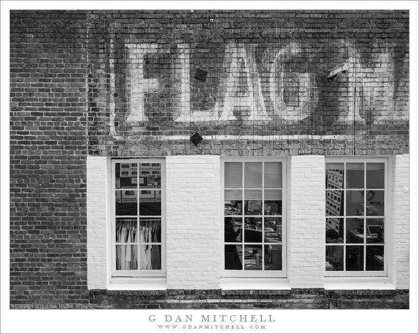
FLAG M

FLAG M
Painted brick wall of an old building, San Francisco

FLAG M. San Francisco, California. February 3, 2017. © Copyright 2017 G Dan Mitchell – all rights reserved.

Painted brick wall of an old building, San Francisco

I seem to be in a bit of a black and white frame of mind today! A few weeks ago I had a chance to head up to San Francisco for a day, mainly to visit the San Francisco Museum of Modern Art (SFMOMA), but also to potentially do a bit of photography. As it turned out, virtually all of that day’s photograph was done in and around the museum, though the site does provide many interesting photographic opportunities, ranging from its architecture to the people inside and including the surrounding downtown neighborhood.

I have photographed this building before. In fact, it is hard to not photograph it. It stands right “behind” the museum and is visible from almost every vantage point on the east side of the building. It is an older brick building but it gives every appearance of having been upgraded and well maintained. While the inside appears to be pretty modern, from what I can see through the windows, the outside retains an aged patina and still includes the remains of some very old exterior painted sign.


G Dan Mitchell is a California photographer and visual opportunist. His book, “California’s Fall Color: A Photographer’s Guide to Autumn in the Sierra” is available from Heyday Books and Amazon.
Blog | About | Flickr | Twitter | FacebookGoogle+ | LinkedIn | Email


All media © Copyright G Dan Mitchell and others as indicated. Any use requires advance permission from G Dan Mitchell.

Interior, SFMoMA

Interior, SFMoMA
Interior photograph of San Francisco Museum of Modern Art

Interior, SFMoMA. San Francisco Museum of Modern Art, California. January 3, 2017. © Copyright 2017 G Dan Mitchell – all rights reserved.

Interior photograph of San Francisco Museum of Modern Art

In the wake of the major expansion and remodel of the San Francisco Museum of Modern Art (SFMoMA), the feeling of the place has changed. Overall I think that the changes are almost universally for the better, and it seems to me that the new space in the tall and narrow “addition” to the rear of the original building works quite well. (I have a few quibbles — including some back galleries that include audio in their exhibits but are not acoustically isolated sufficiently.) The feeling is mostly open and bright, which I think works well for modern art.

The feeling of the original front portion of the building is somewhat as it was, but it has changed, too. The ground level was originally designed to function as a main entrance and assembly space, but now much of that has been moved further back into the new building. The central atrium is still there, with stairs winding around its space, and lit from above by the light coming through the “oculus” at the top that faces to the west. I’m always intrigued by the shapes and colors and light in this space and the way that geometrical forms warp along its curved surface.


G Dan Mitchell is a California photographer and visual opportunist. His book, “California’s Fall Color: A Photographer’s Guide to Autumn in the Sierra” is available from Heyday Books and Amazon.
Blog | About | Flickr | Twitter | FacebookGoogle+ | LinkedIn | Email


All media © Copyright G Dan Mitchell and others as indicated. Any use requires advance permission from G Dan Mitchell.