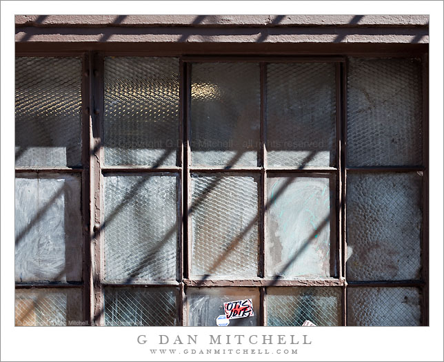
Worn Windows and Shadows. San Francisco, California. March 6, 2010. © Copyright G Dan Mitchell – all rights reserved.
Afternoon shadows fall across worn street-side windows in San Francisco, California.
This sort of window along the sidewalk is common in urban areas like San Francisco, where the occupants of the building want some sunlit but don’t want people walking by on the sidewalk a few feet away staring in at them. (The light glowing behind the glass in the upper left suggests that someone is inside.) I was interested in how worn and grungy the glass has become – it begins with several types of obscured glass, in some of the panes the reinforcing wire is very apparent. They it looks like layers of paint may have been added and partially removed at various times – perhaps the windows were painted out? Perhaps grafitti was partially removed? And more recently someone has added various small paper stickers.
This photograph is not in the public domain and may not be used on websites, blogs, or in other media without advance permission from G Dan Mitchell.
G Dan Mitchell Photography | Twitter | Friendfeed | Facebook | Facebook Fan Page | Email
Technical Data:
Canon EOS 5D Mark II
Canon EF 50mm f/1.4 USM
ISO 200, f/11, 1/60 second
keywords: worn, streetside, street, urban, city, building, structure, pattern, texture, light, afternoon, shadows, panes, frame, brown, paint, cement, obscured, screen, dirty, old, inside, glow, wall, sticker, grafitti, san francisco, california, usa, north america, decay, downtown, stock
Discover more from G Dan Mitchell Photography
Subscribe to get the latest posts sent to your email.


Dave, good observation. Whether or not it turns out to be a successful choice, time will tell, but I wanted the stickers to be in the frame when I made the exposure. But I can understand the two ways of looking at it. On one hand, the sticker is a sort of attention point of color and brightness in a scene that is mostly less well defined and mostly cooler colors, which could be a good thing. But looked at another way – and this is the way I think you are referring to – it could also seem like an interruption to the scene.
Take care,
Dan
I love this shot – the geometry and tonality are super – but I keep finding my eye drawn towards the red and white sticker in the bottom of the frame. I wonder if a different crop would help keep the attention on the main subject (unless, of course, the sticker was what you wanted people to look at!)?