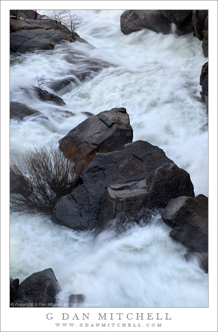
I recently posted the black and white version of this photograph of Cascade Creek in full spring flow.
The color version of this photograph posed a series of post-processing questions and problems that others who have worked with a scene like this one can probably imagine. The creek descends through a narrow, rocky gorge at this point and I photographed it early in the morning before any direct sunlight was able to reach the water. Benefits of shooting at this time included the softer light, which tends to both throw some light into the shadows and to soften the brightest highlights. This also permits a longer exposure which allows the water to blur a bit and express the wild motion of the creek. However, since the primary source of light was the open sky, the camera “sees” a very blue scene. (Our visual system compensates for this, so it doesn’t look as blue as it really is when you are on the scene.)
There are several ways to deal with the color balance issues that this situation creates. You could just “go with the blue,” and I’ve seen photographs done that way. I’ve even seen some in which the photograph amped up the saturation and ended up with something very blue. In general, that’s not my thing! I’m most often looking for something that seems “believable” – it may not be objectively accurate, but I intend it to be “subjectively accurate.” With this in mind, my first instinct was simply to warm the color balance in order to move away from the blue cast and toward a warmer one.
My immediate impression was that this was an improvement, and I worked with this interpretation for several days – but something about it didn’t sit quite right with me. (This is perhaps one reason that I also worked with the black and white rendition in the meantime.) Eventually I did some comparisons between the “warmed up” version and the original… and neither seemed like what I was after. The overly blue original looked garish but the overly warm version seemed artificial. I tried some other approaches and finally discovered that because the blue was so intense that I could simply desaturate it – more than you might think – and keep the “colder” coloration without letting it overwhelm the image.
G Dan Mitchell Photography | Flickr | Twitter (follow me) | Facebook (“Like” my page) | LinkedIn | Email
Text, photographs, and other media are © Copyright G Dan Mitchell (or others when indicated) and are not in the public domain and may not be used on websites, blogs, or in other media without advance permission from G Dan Mitchell.


David: in case you are subscribed to the email for this message, I do still see your post about a possible purple cast… And I appreciated that observation as I worked up a print of this photo. Deciding where to go with these colors in an interesting challenge!
To make things more complex, I managed to delete your voicemail before I could reply. I’ll try to contact you by other means on Friday.
Dan
Thanks to both of you for dropping by, looking, and posting!
David, thanks for the critical feedback on this version of the image. There could be some color casts here that I still need to work on. A monitor, even a calibrated monitor, won’t tell me that as well as a print will – and I did do some color balancing stuff, in addition to the desaturation, that could send things off in directions that I may need to play with some more. I think it looks OK on my calibrated monitor, but we’ll see.
The “what is natural” question is really a wonderfully complex one, isn’t it! As you and other readers know, our visual system doesn’t see color the way the camera does. Our brains adapt and process to let us think we are seeing colors that correspond to what we “want” to see. The classic example is when we see snow under a blue sky as being white, but the camera reveals it to be blue!
Some try to deal with this by going for some sort of objectively correct color, but that doesn’t work for me anymore than leaving the white snow blue does. The “subjectively truthful” color of that snow is probably somewhere between the white that we imagine it to be and the blue that the camera captures, and it is up to us to make some subjective judgments about where that mid-point might be.
The original of this image is bluer than what is seen here. My initial inclination was to warm the image quite a bit, going well beyond what happens in this version. In fact, I “went there” with my first color attempt, initially thought it looked fine, and then as I lived with it became less satisfied. As I thought about it, I wanted to keep something of the cold, hard character of the light in this little gorge, and that meant going back in the blue direction. At this point, I’m guessing that I may end up with even a bit less saturation, perhaps a slight additional shift back toward blue, and perhaps retain the current saturation in a few key areas of the image.
It is funny sometimes how some photographs just sort of work and require not all that much thought in post, while with others it takes a lot more work and time to find the photograph that lies inside the captured image.
Thanks for prodding me to think about this some more,
Dan
Interesting points and questions you raise as to what actually is “natural.” I seem to remember bluish cast photographs of my own that turned a bit purple when I desaturated or increased saturation or tweaked the hue a point or something. Is it my imagination, my poorly calibrated laptop monitor, or is there some “unnatural” purple creeping into this image? Otherwise it is an excellent composition in my opinion and I believe you are generally going in the right direction, though I feel my dad might argue for a bit more blue because that is what he “saw,” rather than taking too much out based on how it “ought” to look under different circumstances. Not to put too fine a point on it, but Dad’s Virginia Creeper strongly exhibits blue and purple tones reflected from the sky that a few others have said are not “natural,” but that is what was happening at the time. Light from the sky is a strong component in some photographs.
I like the direction you took on this one, Dan ! Desaturate seems to work pretty well in those creek photos.