
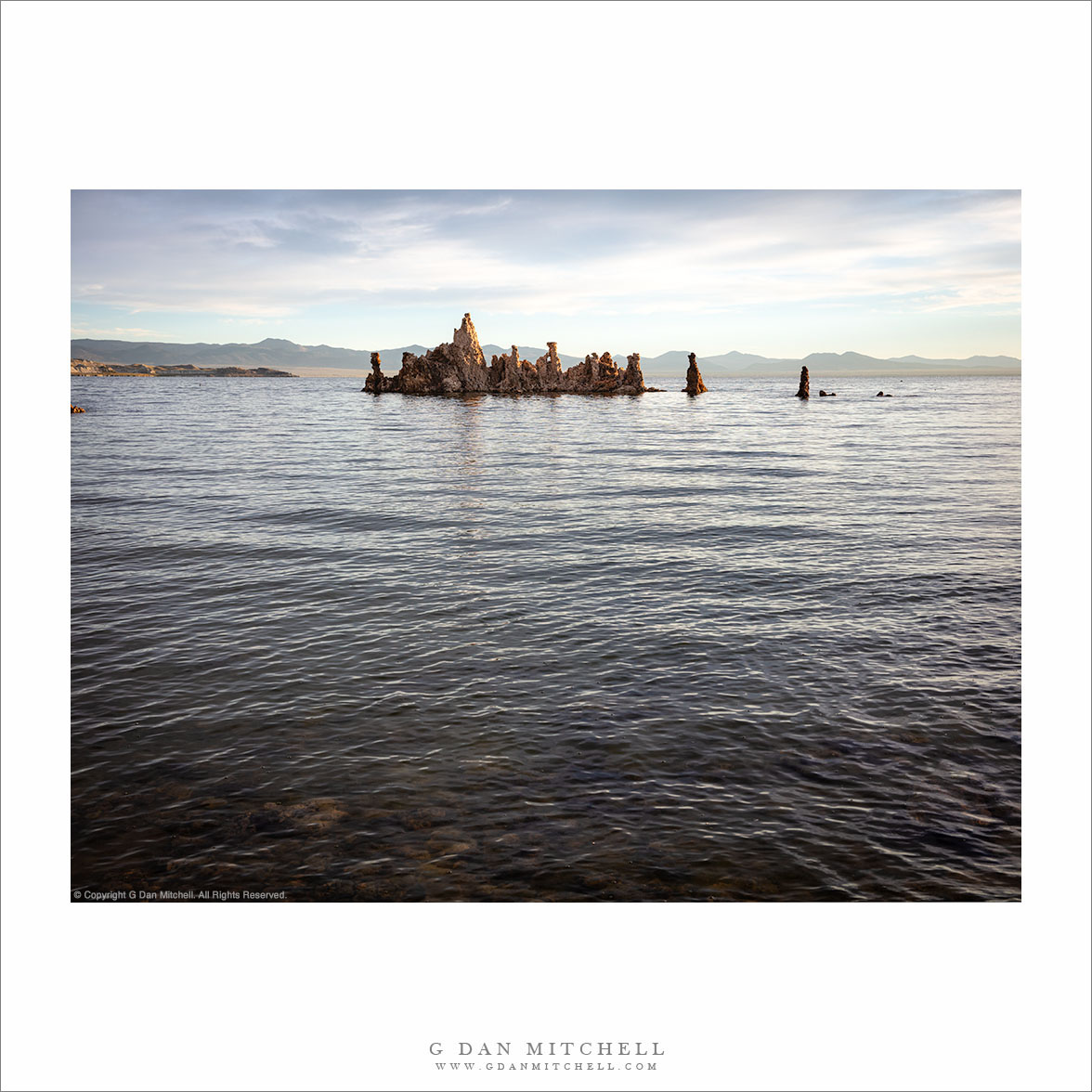
With this post, I am doing something unusual for me — I’m sharing monochrome and color versions of the same photograph. By that I mean literally the same file, though interpreted differently. (The monochrome version was posted here recently.) Usually I settle on either color or monochrome, but in this case I feel like both have something (different) to offer.
While no photograph is an objectively “real” portrayal of the subject, in general — and there are exceptions! — a color interpretation often attempts to be something more in line with how we recall what we saw. That is not to say that we don’t choose what to highlight or make other adjustments to the image that conform to our view of it. On the other hand, monochrome allows us a lot more freedom to manipulate and shape the image, since by giving up color we start with a kind of abstraction of the original scene.
COMMENT OR QUESTION? Scroll down to the comment form.
Prints are available. Read about licensing and print sales.
G Dan Mitchell is a California photographer and visual opportunist. His book, “California’s Fall Color: A Photographer’s Guide to Autumn in the Sierra” (Heyday Books) is available directly from him.
Blog | Bluesky | Mastodon | Substack Notes | Flickr | Email
All media © Copyright G Dan Mitchell and others.