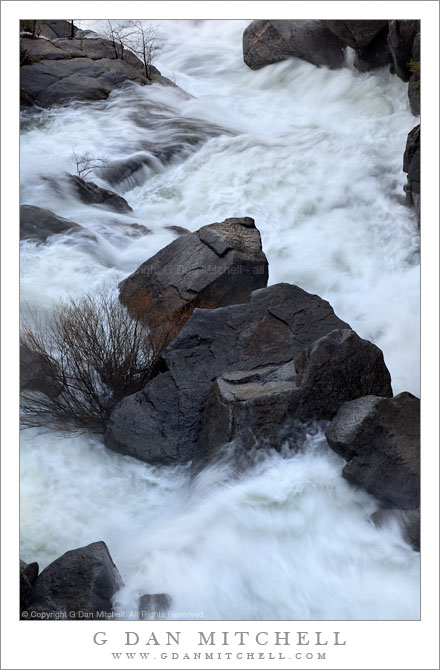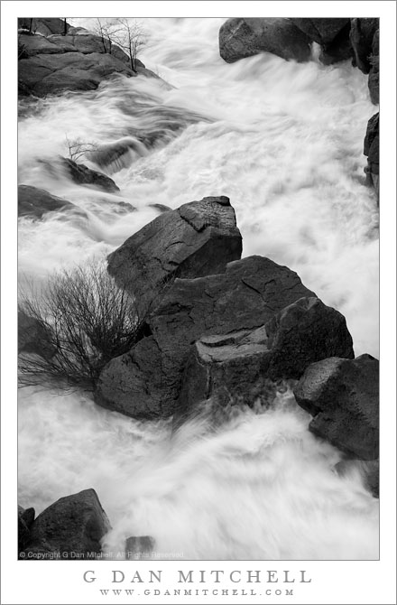
I recently posted the black and white version of this photograph of Cascade Creek in full spring flow.
The color version of this photograph posed a series of post-processing questions and problems that others who have worked with a scene like this one can probably imagine. The creek descends through a narrow, rocky gorge at this point and I photographed it early in the morning before any direct sunlight was able to reach the water. Benefits of shooting at this time included the softer light, which tends to both throw some light into the shadows and to soften the brightest highlights. This also permits a longer exposure which allows the water to blur a bit and express the wild motion of the creek. However, since the primary source of light was the open sky, the camera “sees” a very blue scene. (Our visual system compensates for this, so it doesn’t look as blue as it really is when you are on the scene.)
There are several ways to deal with the color balance issues that this situation creates. You could just “go with the blue,” and I’ve seen photographs done that way. I’ve even seen some in which the photograph amped up the saturation and ended up with something very blue. In general, that’s not my thing! I’m most often looking for something that seems “believable” – it may not be objectively accurate, but I intend it to be “subjectively accurate.” With this in mind, my first instinct was simply to warm the color balance in order to move away from the blue cast and toward a warmer one.
My immediate impression was that this was an improvement, and I worked with this interpretation for several days – but something about it didn’t sit quite right with me. (This is perhaps one reason that I also worked with the black and white rendition in the meantime.) Eventually I did some comparisons between the “warmed up” version and the original… and neither seemed like what I was after. The overly blue original looked garish but the overly warm version seemed artificial. I tried some other approaches and finally discovered that because the blue was so intense that I could simply desaturate it – more than you might think – and keep the “colder” coloration without letting it overwhelm the image.
G Dan Mitchell Photography | Flickr | Twitter (follow me) | Facebook (“Like” my page) | LinkedIn | Email
Text, photographs, and other media are © Copyright G Dan Mitchell (or others when indicated) and are not in the public domain and may not be used on websites, blogs, or in other media without advance permission from G Dan Mitchell.


