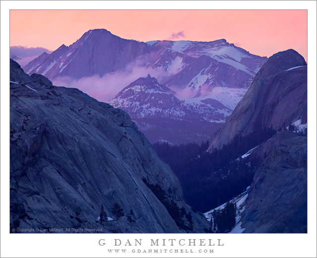
Alpenglow Clouds, Mount Conness. Yosemite National Park, California. June 18, 2011. © Copyright G Dan Mitchell – all rights reserved.
Clouds lit by alpenglow drift across the face of Mount Conness beyond the Tenaya Creek drainage, Yosemite National Park.
Earlier this week I posted another photograph of the same evening. This one was shot a bit earlier (believe it or not!) than the other photograph, as the intense and perhaps unexpected color display was just getting started. I’ll have more to write about the phenomenon in a future blog post that uses this evening as an example, but it almost seem like the sunset progressed backwards (oxymoron alert!) as it went on. It had begun with very boring and low contrast light, somewhat flattened by a haze that took on an increasingly ghastly blue-green hue as the light began to fade. Although the surroundings were spectacular on this opening day of Tioga Pass Road, the light and atmospheric conditions seemed to be conspiring to show them it their worst (literal and figurative) light.
But just at dusk a hint of pink appeared in some of the clouds ringing Mount Conness, the tall peak in the upper left. At first it was so faint that only those of us who were looking for it might have noticed, and we perhaps thought that we were simply trying to convince ourselves that something was going to happen. But the color increased, and as the more distant areas picked up better light, they shone through the foreground haze more clearly, and this haze faded in the same way that a scrim does in a theater when the front lights dim and the stage lights rise.
I find that this type of scene provides some of the most difficult technical and judgment challenges. So often the goal in an image, especially if it is going to be a print, is to try to get as much light into the scene as possible. A lot of the work in post-processing, at least for me, is done with the goal of trying to fill the image with light by means of various careful adjustments, often involving the use of masked curve layers. But here, the coloration depends upon not being overly bright – too much light either decreases the intensity of the pink and purple shadings or else sends them off into the land of the grotesque and gaudy. And the light in shadows – and there are a lot of shaded areas in this scene! – is very blue, much more so than the untrained eye would imagine when looking at the scene in person. This requires another set of tricky and subjective judgments – it would not look right to leave portions of the scene as blue “as they really were,” nor would it look right if the blue were diminished too much. But how much is right? There is no objective answer that I know of, so the goal (for example, on the large granite face of Polly Dome at the left) is to come up with a balance that seems blue enough but not too blue. A similar issue arises in these dark areas when it comes to deciding how bright is bright enough. Believe it or not, virtually nothing in this image is actually black, with the possible exception of a few very tiny areas in the lower left. The luminosity of the very dark areas had to be lifted a bit… but how much is just right? Again, a matter of personal judgment about which there is no objectively right answer.
All of that technical stuff aside, this evening provided one of the most glorious, albeit brief, displays of sublime light I have seen in the Sierra.
G Dan Mitchell Photography | Flickr | Twitter (follow me) | Facebook (“Like” my page) | LinkedIn | Email
Text, photographs, and other media are © Copyright G Dan Mitchell (or others when indicated) and are not in the public domain and may not be used on websites, blogs, or in other media without advance permission from G Dan Mitchell.
Discover more from G Dan Mitchell Photography
Subscribe to get the latest posts sent to your email.

