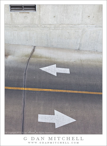
Driveway, Arrows, Yellow Line. Seattle, Washington. May 5, 2012. © Copyright 2012 G Dan Mitchell – all rights reserved.
White arrows and a yellow line painted on a parking lot driveway, Seattle, Washington.
Another in the series of photographs of urban forms, shot in Seattle in early May. The story, and this isn’t the first time that I’ve mentioned it, is that I had a free hour during a visit to Seattle. I found out that there was a “Seattle Photo Walk” going on in the Fremont District, which I think I may have passed through before but where I had never photographed – so I met up with the group and spent an hour wandering around in the Fremont area.
I made quite a few photographs during that short time, and near the end of my hour I crossed back into Fremont by walking across a bridge, and this bridge turned out to figure in several photographs, either as a subject or as a vantage point. In this photograph it is merely the vantage point, as I shot into this driveway leading to an underground parking area while walking across the bridge. The opposing arrows were an obvious interest, but I also was intrigued by the single yellow line cutting through the scene and the overall concrete grayness of this spot.
G Dan Mitchell is a California photographer whose subjects include the Pacific coast, redwood forests, central California oak/grasslands, the Sierra Nevada, California deserts, urban landscapes, night photography, and more.
Blog | About | Flickr | Twitter | Facebook | Google+ | 500px.com | LinkedIn | Email
Text, photographs, and other media are © Copyright G Dan Mitchell (or others when indicated) and are not in the public domain and may not be used on websites, blogs, or in other media without advance permission from G Dan Mitchell.
Discover more from G Dan Mitchell Photography
Subscribe to get the latest posts sent to your email.


Hi Dan,
Thanks for sharing that photo. I like how something that is as simple as a driveway can be turned into something with depth with a single photograph. I also found it cool how you made the setting more interesting by including the vents in the upper left hand corner to really illustrate the ‘concrete grayness’.
Thanks for your post and for your kind words about the photograph. I like your point – which I hadn’t quite thought of – that the inclusion of a bit of non-concrete material tends to emphasize the fact that everything else is concrete.
Dan
Interesting question. I think that this subject could be framed in a variety of ways, depending on the effect that one is trying to create. One answer might be, “this is the way I saw it.” Beyond that, I think I liked the idea of including the forms of the arrow and line in the context of their actual surroundings a bit. I also like dividing the frame into three sections vertically, and I like the dissonance between the diagonals of the lower section and the more squared-of horizontals in the upper part of the frame.
Take care,
Dan
(BTW: When I posted this to the new timeline view in Facebook, it did crop it to a square… that I didn’t like! :-)
Why didn’t you go with, say, a square format and remove the top portion?